Thanks to David we had an afternoon of salt printing again. This time Tory came along to give her hand a try at the process and she left with two stunning prints. I only had time for one, which is scanned in above.
I love it!
David’s found a new source for paper too, and this stuff has a faint texture (which you can see in the scan) but isn’t as heavily mottled as the previous paper he used. It’s very nice stuff.
Someday I’m going to build a semi-darkroom for this…
At David’s suggestion I called around and found that trophy supply shops can supply pre-cut sheets of aluminum, 12 x 24”, covered in a protective piece of plastic. I figured I’d give it a try and ordered three sheets: satin aluminum, shiny aluminum, and gold-coloured steel.
I finally had a chance to give them a try this weekend. I also decided to use the ICC profile from Booksmart Studio instead of my custom profile to see if that would resolve the issues I had printing in colour last time. Finally, I learned that I can configure any media type on the printer to use the front feed path, so following the instructions at Booksmart Studio I used Semi-Glossy Photo Paper instead of POP Board for these tests.
WOW. What a difference.
Satin aluminum
Shiny aluminum (and also a self-portrait!)
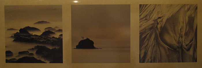
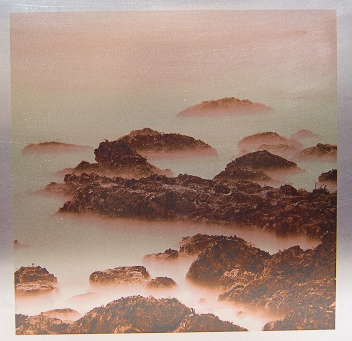
Gold-coloured steel
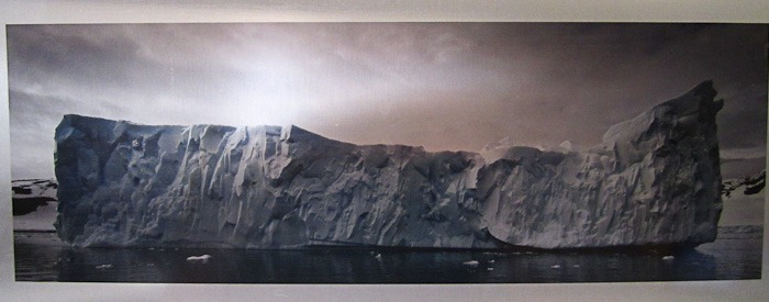
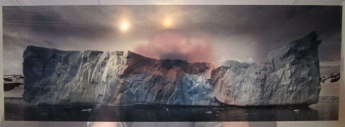
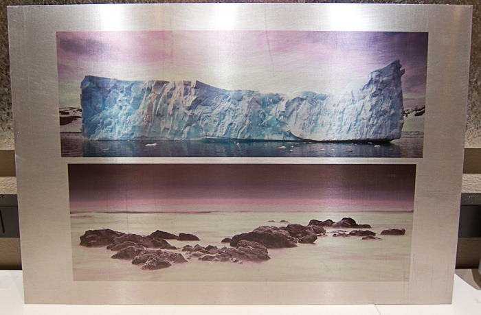
Yay! As you can tell from the two iceberg images the colour problems are solved. The quick photographs don’t do these justice. The icebergs just leap off the page. The shiny aluminum is way too shiny but it was fun to test on. The gold steel is very interesting and works great with my B&W beach images.
At the moment the last remaining issue I have is figuring out how to get clean coatings on the aluminum. You can’t tell in the photo but the satin aluminum coating is awful. There’s dog fur in it and thumbprints everywhere. The shiny aluminum is much better but has streaks (which you can see in the top left of the image). That particular piece was also a test of just doing a single coating of InkAid instead of two.
I’ve tried spraying the InkAid, diluted 10% with distilled water, but it was a complete disaster. Runs everywhere and the stuff came out of my Wagner HPLV sprayer in gobs instead of a nice fine mist. I may try one of David’s really fancy brushes instead of the cheap foam brushes I’m using currently.
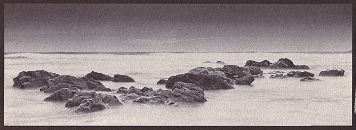
Another weekend, another trip to David’s for more alternative process fun. This time our process was salt prints, and as with previous trips he was gracious enough to pre-test the process and get some of the sheets of paper salted before I arrived. All I had to do was coat the paper with the silver emulsion, expose the digital negatives (16 minute exposure), then rinse, tone, fix, and rinse.
Here’s the first print:
First Beach, WA. Salt print, then gold toned for 4 minutes.
We were a little disappointed at how this one turned out. It looks like either the paper fogged a bit during coating or that the curve was a little off for the digital negative. The highlights look better in the scanned image than they do on paper (they’re a little too dark for my taste).
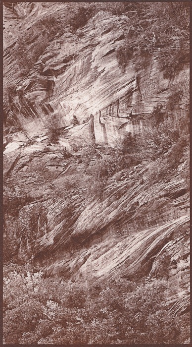
Here’s the second print I made:
Zion National Park. Salt print, un-toned.
This print is a home run. You can’t tell at all from the scan but it’s amazing in person. Beautiful tonal range, lovely highlights, and cool chocolaty shadows. I am very, very, very happy with how it worked out.
Salt printing is pretty darn cool. It’s not that much different than traditional gelatin silver printing, but the tones… wow.
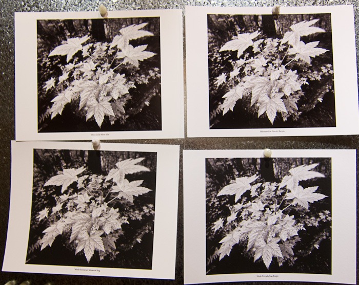
From left to right, top to bottom: Ilford Galerie Gold Fibre Silk, Hahnemuhle FineArt Baryta, Moab Somerset Museum Rag, and Moab Entrada Rag Bright 300gsm
On Tuesday evening I’m speaking to the Seattle Street Photography Club about how to make awesome black and white prints. As part of the talk I’ll be sharing my thoughts on paper selection and how to make smart paper choices.
Of course you can’t talk about paper without showing samples! The photo above shows the four prints I’ll be bringing along to explain the difference between glossy and matte, warm and cool. For those that aren’t familiar with the papers by name, the top row is glossy, the bottom row is matte, the left column is warm, and the right column is cool.
I actually wanted to use a different paper for glossy cool but the Harman by Hahnemuhle Gloss Baryta is out of stock pretty much everywhere. My other option was going to be Hahnemuhle PhotoRag Baryta but I couldn’t find any of that locally either. Ah well.
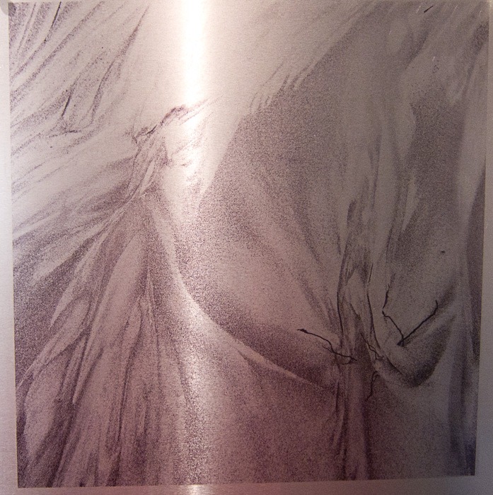
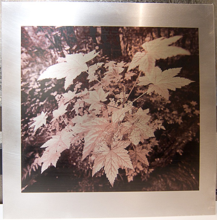
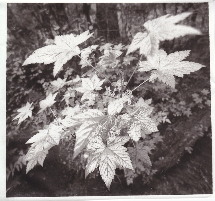
This is one of my classic images that I decided to try toned since the leaf image (which is also lightly toned) printed very well. I’m starting to see a pattern here: sepia toned is good. You’ll notice though that this particular piece of aluminum wasn’t in good shape. Lots of scratches and what appears to be a coffee cup stain in the top right corner. This is despite repeated cleanings on my part.
The straight black and white image I tried yesterday didn’t work well at all but I figured I’d give it another shot. This time I printed in monochrome mode on the printer instead of in colour mode. Big difference. I’d consider this a proper black and white, even if the image itself doesn’t seem to lend itself well to the aluminum process.
I’ve learned a ton about what works and what doesn’t when printing on aluminum. Now to find some more aluminum that’s higher quality. David mentioned trying an engraving supply place and that sounds like an excellent idea. A few quick Bing searches online shows that you can get 12×24” sheets of aluminum, covered in PVC to protect it until printing. That sounds like exactly what I need!
This time around not so much love. That’s a LOT of magenta cast, folks. I wonder why. Honestly, both images look awful. I thought this might be from a double-profile application but I checked and it was off in the print driver and correctly selected in Lightroom. The printer is squawking about being low on GY ink but it would stop if it really didn’t have enough to print.
Oh well. At least I can just wash it all off and try again.
After reading so much about Dan Berg’s experiments coating and printing metal on the Luminous Landscape Printing forums I figured I had to give it a try. After many back and forth messages with Dan I was ready to take the plunge.
The Metal
The metal is 0.025” 5025 aluminum from Metal Supermarkets. I had a painful time finding a local source as none of the roofing supply companies had any. Metal Supermarkets came to the rescue again (I used them for the galvanized metal that makes up my print viewing board). I had them cut me four 12×12” and four 12×18” pieces out of a 4×10′ sheet that was relatively clean of scratches.
The Cleaning
Oh man. The cleaning. I tried all sorts of ways to clean the metal to find what would be the fastest way.
The dishwasher: This did NOT work. I tried one sheet of each size and while the bottom 3/4 of each sheet came out clean the top edges where they touched during washing was all discoloured. No amount of scrubbing would get rid of it.
Metal polish: This kinda sorta worked. It really makes the aluminum go black until you buff it really hard. Not worth the effort
Bon Ami and water: This cleaned reasonably well.
Rubbing alcohol: This also cleaned reasonably well.
Next time around I will do the steps on the InkAid site: using dishwasher powder like Cascade and then following up with rubbing alcohol.
I also tried buffing the aluminum with 0000 steel wool. It certainly buffs but it also leaves obvious fine scratches. If you want a directional pattern to the underlying aluminum this is the way to do it. If you don’t… don’t use the steel wool!
The Coating
Dan uses InkAid to coat his metal. Unfortunately they don’t have any local sales channels. I’ve got an order in for a quart but didn’t want to wait for it to show up. David mentioned Daniel Smith sells Golden Digital Grounds so I picked up a bottle of that.
My first coating attempt was with my HVLP sprayer. Complete and total failure. It just sprayed globs everywhere. I’m sure it’s possible to do (the InkAid folks list it as one of the application methods) but I didn’t have the patience to play with pressure settings and whatnot. I fell back to using an $0.86 foam brush from Home Depot. It actually coated relatively easily. One coat in a horizontal direction, followed by a second in the vertical direction once the first coat dried. Total drying time was only about an hour per coat. Not bad!
The Printing
Once I got to this point it was honestly pretty easy. I ran the print on a Canon iPF5100 using POP Board as the media type. This kicks on front loading of the media and provides a perfectly flat printing path. I had to make sure to pull the printer far enough away from the wall so the sheet could come out the back during printing.
I made a custom profile for the aluminum sheet using my Spyder2. It read the target print surprisingly well.
The hardest part of printing is getting the aluminum to load straight. There’s one tiny orange mark you’re supposed to align the edge of the sheet with and it’s very easy to be slightly off and have the printer complain about the aluminum being crooked. When I did the profile target it took me six tries to get the sheet loaded properly. I had better luck this morning with the real print: it only took three tries.
The Result
I’m quite pleased with the result considering I’ve never done this before. There are definitely some issues in the darkest areas of the print. The ink has cracked a bit on the coating and is rather splotchy in some of the very dark shadow areas. I’m not sure if there’s anything I can do about that since I can’t control the amount of ink the printer lays down. I wonder if the InkAid coating will work better.
The only thing I haven’t done at this point is apply a couple of coats of spray varnish to protect the print and add some more gloss. That’ll happen later today.
Canon 5D Mark II, 70-200 2.8 IS II at 200mm. ISO 400, 1/125 sec. @ f/2.8.
(Just going by the numbers I’m guessing I handheld this one! Thank goodness for IS lenses.)
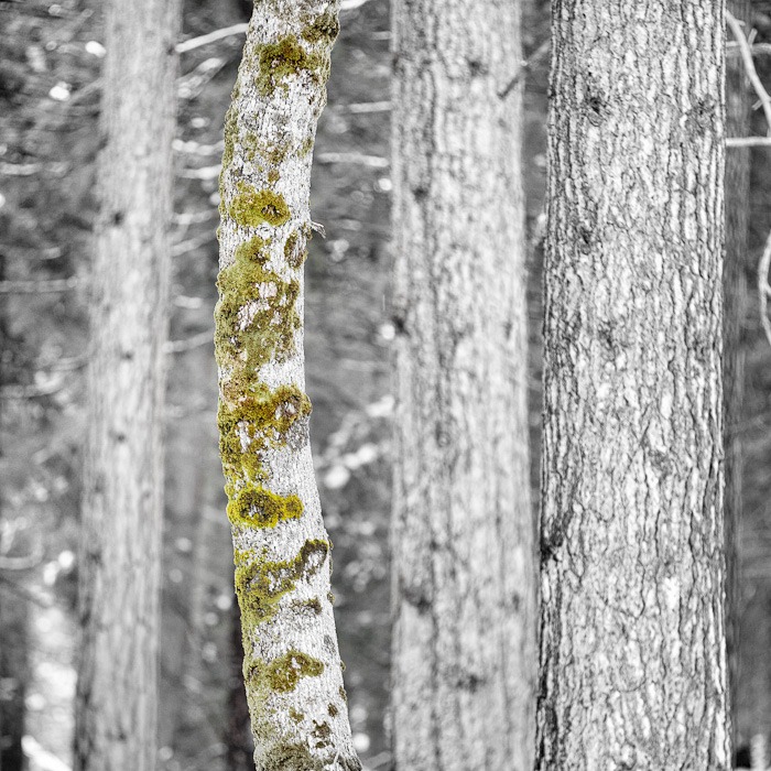
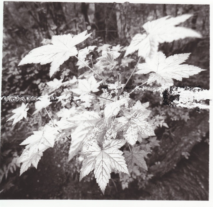
I saw this curvy tree from across the road and spent about 5 minutes walking back and forth trying to get the right position of it against the others in the background. The above interpretation is really just more explorations of Silver Efex Pro 2.0. As you might have guessed the new version adds support for selective colour. I’m liking how it looks in this image, but I definitely have more work to do.
Things I don’t like about the above version:
The tree on the right is too bright and competes with the curved tree. It looks too far forward in the frame. That’s a relatively easy fix: just darken that side of the image to make it recede.
The bottom left looks like it has a bright white ghost hiding in the trees. Again a simple burn will take care of that problem.
The overall image seems to light to me. That was just my bad on the processing side and can be fixed with a few slider tweaks here and there.
Still, as a proof of concept I like where it’s going!
Canon 5D Mark II, 70-200 2.8 IS II with 1.4x extender at 280mm. ISO 100, 1/60 sec @ f/22.
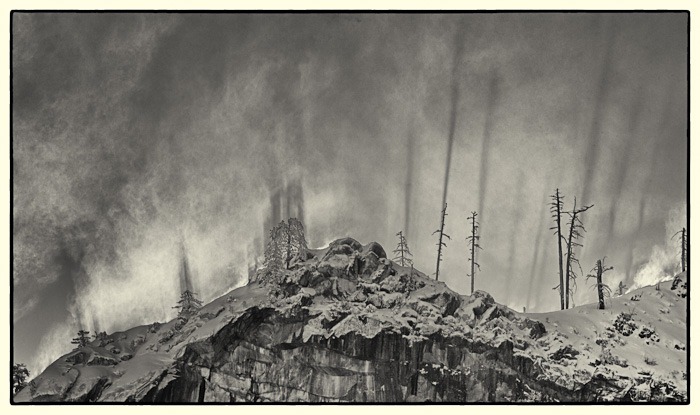
Last weekend I had the pleasure of going to Yosemite National Park for the very first time. Three other photo friends joined me for four days of shooting, eating, and playing Scattergories. We expected some snow, but didn’t count on getting two feet in two days. It made driving a bit of a challenge!
The above image is from sunrise on the 3rd day of our trip. I have to admit that for the entire trip I really wasn’t feeling in the groove. The scenery is amazing but it’s all been shot before. Many, many, many, times before. By people far more talented than me.
But after I got home and flipped through my photos I have to admit I was pleasantly surprised. I didn’t realize it at the time but my mind was in B&W mode the entire trip and my top images reflect that. I’m still not convinced I have any portfolio-worthy shots, but there are definitely fun images that make me smile.
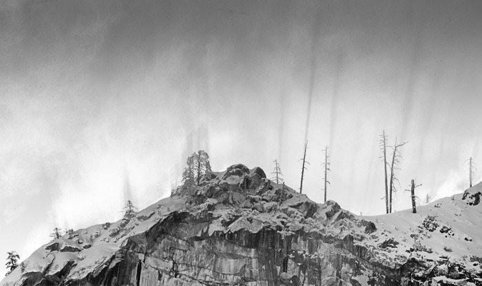
The above photo is one of two treatments I’ve done on the same base image. All processing was done in Silver Efex Pro 2.0 as a way to try and learn the program. Don’t like the above version? Try this one on for size instead:
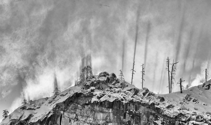
I’m not entirely happy with either one but do see that potential is there. So… back into Silver Efex for a third attempt:
Not bad, but man, do I ever need to clean my sensor!
After trying my hand at cyanotypes a few weekends ago I spent some time browsing the Bostick and Sullivan website. So many cool things! What caught my eye was the PDF on the front page about carbon prints. I’d never heard of them and honestly they sounded wicked cool.
A quick e-mail to David and a date was set. Today, 1pm, his place. David ordered some of the carbon tissue in advance and already had all the other supplies. He was even kind enough to take care of sensitizing the tissue a few days ahead of time. I brought a box of Moab sample paper I had kicking around. Four hours later I had my first two carbon prints.
Holy doodle.
Before I get to pictures and video I have to tell you that the scans do a horrible job of communicating how incredibly nifty this printing technique is. Unlike every other print I’ve made these actually have depth to them. The darker areas are physically thicker than the lighter areas. That metallic inkjet paper everyone is so excited about? These prints kick their ass.
Ok enough with the talk. Time for some scans. All images are from a digital negative printed on Pictorico OHP using David’s platinum curves from his prior platinum/palladium work, exposed for 4 minutes on paper sensitized with a 3% dichromate solution. Here’s the first attempt using Moab Lasal Photo Gloss 270:
As you can see I screwed up 🙂 When I was using a squeegee to mate the exposed carbon tissue to the Lasal paper I accidentally caused a ripple on the back that transferred through. It does clearly show you what I mean about depth though. Those are real ripples that you can feel with your fingers on the finished print.
The second attempt is on Moab Colorado Satine 245:
As you can see this one turned out ripple-free. Yeeeeeeeeeeeeha! Considering this was my second every carbon print I’m pretty darn excited. The only downside is the paper did not handle the trip through the water well at all. It curled like crazy while drying and the layers have started to separate. Honestly the finish isn’t nearly as good as the Lasal Photo Gloss.
One of the craziest things about this process is that development actually removes material. In some ways it’s the exact opposite of lith where the shadows come from infectious development. Don’t understand? Check out this little montage of David developing his print (on Moab Lasal Photo Luster 270):
Bottom line: this process is freaking awesome. A few things for me to try next time:
I want to try another really glossy RC paper, most likely Kirkland Signature Professional Glossy Photo Paper since I have a lot of it around.
I want to try a matte paper, most likely Moab Somerset Museum Rag. Given what I saw today I have low expectations but I’m willing to give it a shot.
This process is extremely well suited to images where the foreground objects are very dark when compared to the background. Since the darker areas are physically thicker on the paper they appear to come forward, with the lighter areas receding. In hindsight the image I used for my first test is exactly the other way around!
The final image needs more contrast. That’s easily fixed in the digital negative though.
The Lasal paper picked up a wicked dichromate stain (almost fluorescent green/yellow). The Colorado paper fared much better. Both were cleared using metabisulfate and sodium sulfite which helped a ton, although the Lasal paper still has a tint to it.
Thanks again to David for providing all the workroom facilities to make these prints today. We can’t wait to do it again!