I hated this assignment. It was the hardest of the entire class. The weather didn’t cooperate. I didn’t like most of my photos.
It seemed simple enough when we got it: we had two weeks to shoot a 12-15 image picture package that told the story of a place, similar to the “36 hours in…” vacation stories in The New York Times. Since I figured most people would shoot Seattle and I wanted to be different, Shan and I dropped Cooper off with Becky and went up to Vancouver for the weekend.
It rained. It was cold. I was uninspired.
It got worse though. The following week our class had a guest speaker, Michael Hanson, who shoots a lot of travel photography. After class I asked if he would mind flipping through my selects from the weekend in Vancouver. He obliged.
Then he ripped them apart. The fundamental flaw? They didn’t make him want to visit Vancouver, and he was right.
So that weekend Shan and I went back to Vancouver for another try. I didn’t get spectacular images but I got enough to salvage the assignment. Here are the most successful photos:

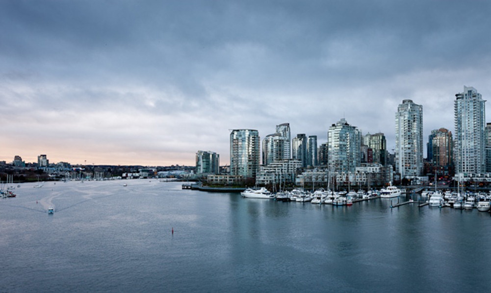
The downtown Vancouver, BC, skyline on Saturday, Feb. 18, 2012. (Photo/Neil Enns)
This photo is from the second trip to Vancouver and was on my list to get. About 10 minutes after I took this photo, just before the light got really nice, it started to pour. Not little misty Seattle rain, but a proper downpour. It was just that kind of assignment.

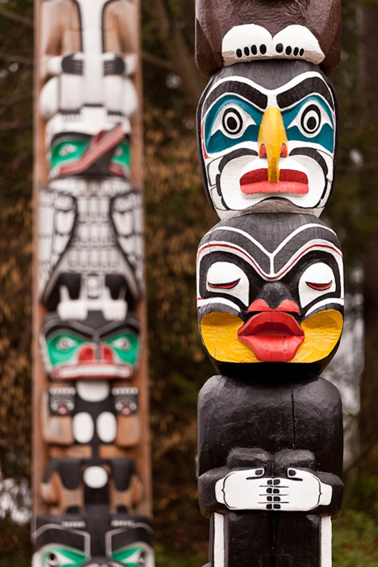
The Kakaso’las totem pole, front, stands in Stanley Park, Vancouver, BC, on Sunday, Feb. 12, 2012. Carved by Ellen Neel and her uncle Mungo Martin, the pole was completed in 1955 for the Woodward’s Department Store. (Photo/Neil Enns)
From the first trip to Vancouver, this photo is my favourite detail image from the assignment. I can easily see it being an inset photos as part of an article on Vancouver.
You’ll note that I said the package should have 12-15 images and I only posted two. That’s because the above two photos are the only ones from the group I submitted that I really thought would sell Vancouver.
As I mentioned at the start of this post, I hated this assignment. I learned I am not a travel photographer!
Lighting made my images for this assignment successful: this was the only assignment where the weather was sunny and clear. Every other week, for every other assignment, the weather was cloudy, rainy, and generally awful. Honestly that was a good thing though as editorial photographers rarely get to pick when they shoot. The practice capturing good images in bad weather was worth it.
Assignment 4 was pretty straightforward: shoot a picture package for a magazine. Pick a topic and submit a set of 10-15 photos. The key thing to do is ensure the photos have variety. The idea is to give the photo editor of the magazine lots of options to work with. Matthew’s one word of advice was to pick something easy to shoot on multiple occasions. Those were wise words!
As luck would have it my daily commute takes me past the Lake Washington Rowing Club. In another stroke of luck the sun rises right around 7:45am in early February and bathes the club in beautiful morning light. On top of all that my commute takes me past the club just before 7:45am, and the rowers like to be out on the water around then.
Yeah, it was my lucky week.
I made five separate stops at the rowing club (one of which was in the early evening for a different look) and came up with 15 solid photos to submit. With the light working my favour every time I stopped by the images were easy to come by! Here are a few my favourites:

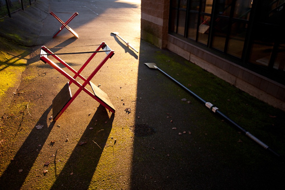
Shell stands and oars lie outside in the morning sun at the Lake Washington Rowing Club in Seattle on Friday, Feb. 3, 2012. Founded in 1957, the not-for-profit club offers a range of classes from introductory lessons to member-specific programs. (Photo/Neil Enns)
Did I mention the lighting was good? *grin*

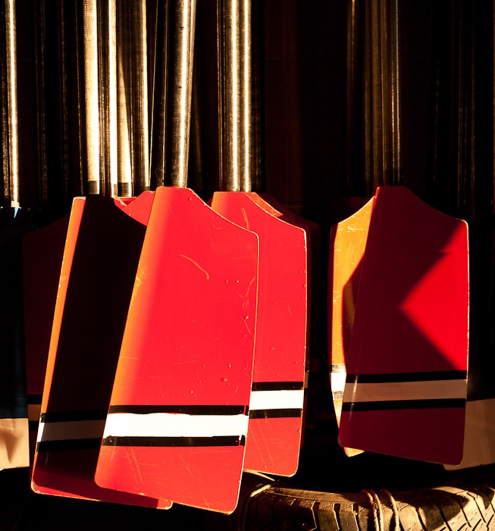
Oars hang inside the Lake Washington Rowing Club in Seattle on Saturday, Feb. 4, 2012. Founded in 1957, the not-for-profit club offers a range of classes from introductory lessons to member-specific programs. (Photo/Neil Enns)
The above photo is my second attempt at the image. I saw the light on the oars on my first trip to the rowing club and took a photo, but when I reviewed it later that day I really didn’t like the composition. Thankfully I had easy access to go back for a second try.

Returning from a trip, Coxswain Rebecca Cheung (rear) guides a mixed sweep team back into the dock in Seattle on Saturday, Feb. 4, 2012. A coxswain since 2004, Cheung says the best part of leading a rowing team is seeing the gradual improvement over a season and knowing she played a key role in it. (Photo/Neil Enns)
One challenging part of this shoot was finding ways to show people rowing in compositions other than “lone rower on the water”. Towards the end of one morning a big shell returned to the dock and gave me the opportunity to get something different. It was just dumb luck that Rebecca was leaning out like that when I pressed the shutter, but I’ll take it!

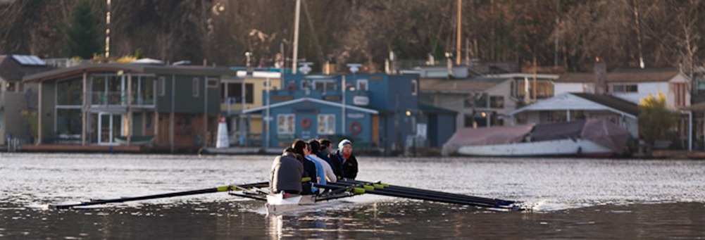
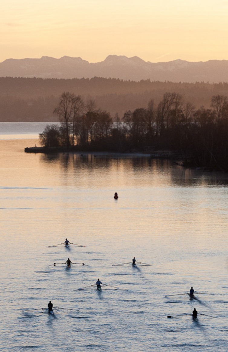
A group of rowers head towards Lake Washington in Seattle on Monday, Feb. 6, 2012. (Photo/Neil Enns)
Despite four trips to the rowing club I still didn’t have an image that worked as a strong “closer” for the set. On Monday morning I had my gear with me and planned to stop at the club one last time to see if I could get something that would work. I never made it to the club 🙂 As I was driving over the Montlake Bridge I saw a few rowers paddling below me. I found the nearest parking garage to the bridge, jammed my car into a spot, grabbed my gear, and ran to the bridge for some photos. I got my “closer”!
I learned a couple of things this assignment:
- If you see something, get the heck out of your car and go take the damn picture! I’d almost convinced myself that it wasn’t worth the hassle of trying to park. If I hadn’t stopped I would have missed the best shot of the set.
- Pay close attention to the mix of photos you’re taking. I wound up with good detail images, good single-person images, but not many “people together” images. It wound up making the final set feel like rowing is a solitary sport, and missed out on showing the great camaraderie I saw at the club.
Overall it was a success and I really enjoyed the project. The Lake Washington Rowing Club members welcomed me warmly and made the photos a pleasure to take.
I was looking forward to this assignment from the first day of class. The syllabus had dire warnings that we couldn’t miss this evening and that we had to bring all the necessary gear to shoot, process, and submit that evening. I figured we’d show up at class, find out what the assignment was, run out, get pictures, come back, and submit, all in one evening. Just like a real newspaper assignment.
I was mostly right. Turns out Matthew’s fiancée suggested he have some pity for us and tell us the assignment the night before, which he did. And then the next day class was cancelled due to snow, so we actually had a full week to think through what we were going to shoot.
The assignment: your newspaper editor has a hole to fill in the next day’s paper and wants to to go and get two photos that show people in Seattle at night. You can start shooting at 6pm, and have to submit your images by 11:30pm.
Awesome.
Even though I had the extra week to prepare I totally blew it and didn’t try to find places to shoot until the day of class. I found this part stressful because I wanted to be different. I guessed (mostly correctly) that many in the class would turn in photos of restaurant windows and people walking Capitol Hill. Those were the obvious locations, and I wanted the non-obvious.
Through a friend I arranged for access to a dive bar (just in case), and then started to see if I could come up with something better. I tried the Seattle Symphony and the Seattle Shakespeare Society, both of which had performances that evening, but since I was late getting in contact with them their responses didn’t get to me in time (in all fairness they were willing to work with me, just not on such short notice).
Finally, in desperation, I talked to some of my Storm contacts and got the name of the PR person for the UW Husky Women’s basketball team. He was kind enough to get me a press pass for that evening’s game so I was set: shoot the first half of the game to get one photo, then go to the dive bar for my second shot.
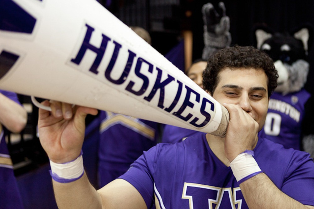
The basketball game was fun. It had been months since I shot a Storm game and it was great to get back in the groove and to see so many familiar faces. While shooting my goal was capture all the activity around the game, rather than trying to grab a game action shot. I came away with several candidate images, and in the end submitted with this one:

Holding his megaphone, Senior Shadain Akhauan cheers the University of Washington Husky Women during a basketball game in Seattle, WA, on Thursday, Jan. 26, 2012. The Huskies beat the Arizona Wildcats 77-48 and improved their record to 3-5. (Photo/Neil Enns).
The photo provoked a heated debate in class. Several people felt it didn’t fit with the assignment criteria as it wasn’t obvious that it was taken “at night”. A few people also didn’t like how Shadain’s eyes were squinty. I don’t agree with the “at night” comments, but the squinty eyes are a little bothersome.
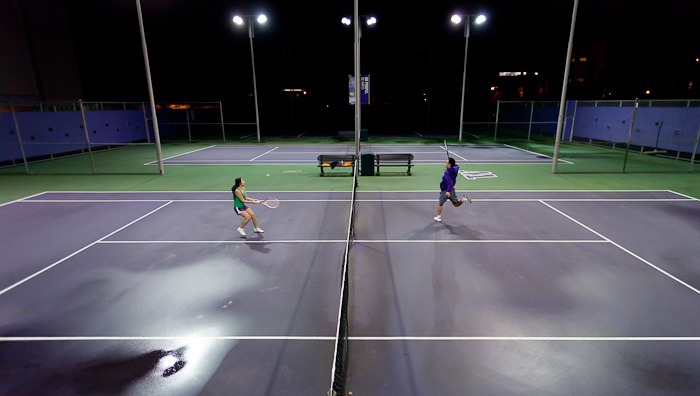
After shooting the game for a while I packed up to head out to the tavern, which honestly I wasn’t wild about. I was saved by two people playing tennis. Outside. In the dark. On a Husky tennis court. Awesome! I never did make it to the bar, because for the next hour I worked the scene trying to find a unique angle. When I found the angle I wanted it became waiting game, standing in the cold with my finger on the shutter for the moment to happen. Finally it did, and I had image number two:

Crashing the net, Vicky Tran, left, and Kevin Huynh, right, play tennis under the lights at the University of Washington in Seattle, WA, on Thursday, Jan. 26, 2012. The cousins say they were craving tennis after growing up playing the game daily in their hometown of Kent, WA. (Photo/Neil Enns).
This photo wound up being my second most successful image from the whole class (you haven’t seen the most successful one yet, it’s coming up in a few assignments). I also learned a valuable lesson shooting it: hide your damn camera bag! I’d left my camera bag on the ground next to the benches in the image, and about halfway through shooting realized it was in every shot looking out of place. I had to go down and hide it behind the garbage can. Good thing I caught that early, because I’d have been mighty disappointed if the above image had my bag in it!
One thing I haven’t mentioned yet is that we are allowed to submit a handful of alternate images for each assignment. Of the alternates I submitted for this assignment Matthew liked the following:

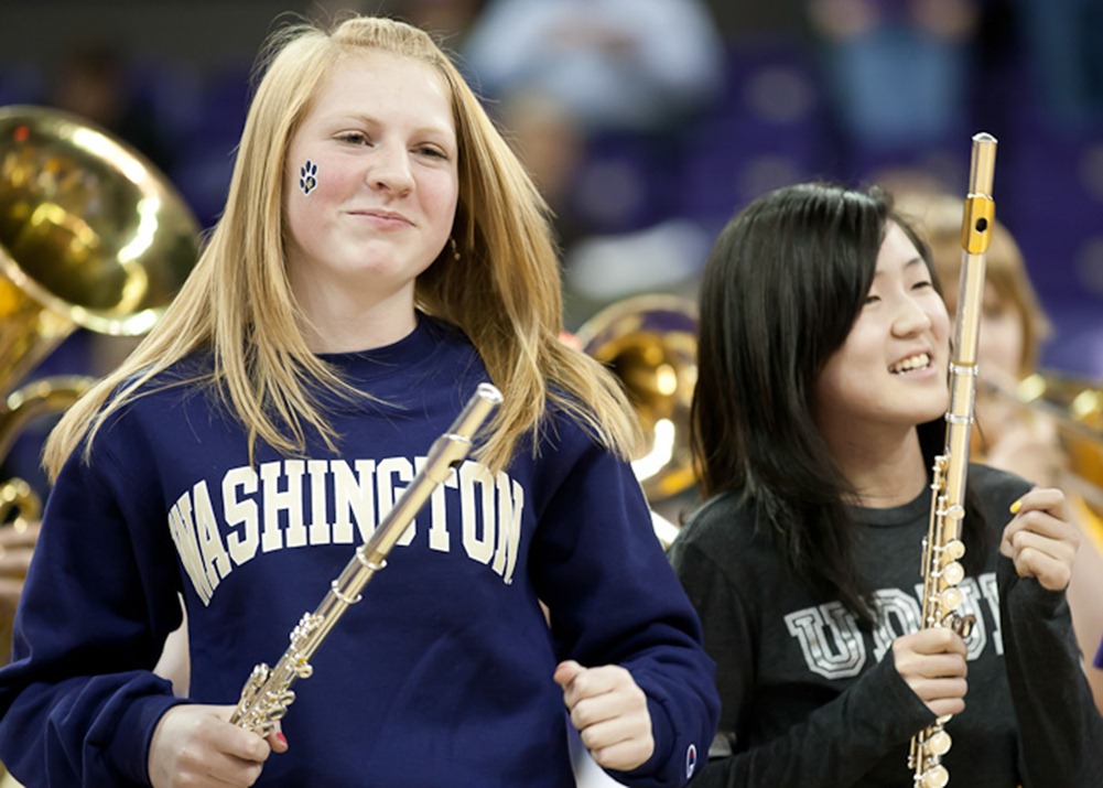
Dancing during a song, 14-year-old Caryln Beaudry, left, and 13-year-old Jubilee Cho, right, perform with the Whitman Middle School Grade 8 band during halftime at the University of Washington Husky Women’s basketball game in Seattle, WA, on Thursday, Jan. 26, 2012. The Husky Women beat the Arizona Wildcats 77-48. (Photo/Neil Enns)
In class the week after this assignment we took everyone’s “Seattle at Night” photos and, as a class, edited them down to a final set of 12. That was crazy fun and and prompted vigorous debate about several images. I’m proud to say that the photo of Caryln and Jubilee, as well as the tennis photo, made the final group of selects!
Our second assignment was for four images: two environmental portraits and two personality portraits. We had two weeks to get them done. The catch? The environmental portraits couldn’t be of anyone we knew.
Another challenge during this assignment was the snowstorm that hit during the first week. That proved to be a blessing as class was cancelled and the assignment was extended one week.
This assignment taught me about the importance of a personal network when doing editorial photography, something that proved valuable throughout the class. It also taught me about asking for access to locations well in advance of the assignment deadline!
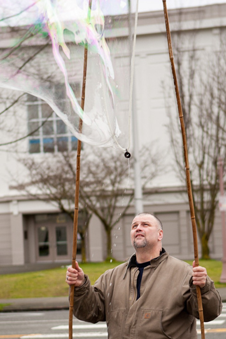
I also carried my camera with me everywhere during these three weeks, and stopped numerous times to get photos of people I wouldn’t normally have approached (my UPS driver, a Snohomish County plow operator, random Les Schwab employees, a firefighter from a nearby station, and a random guy blowing giant bubbles on a street corner).
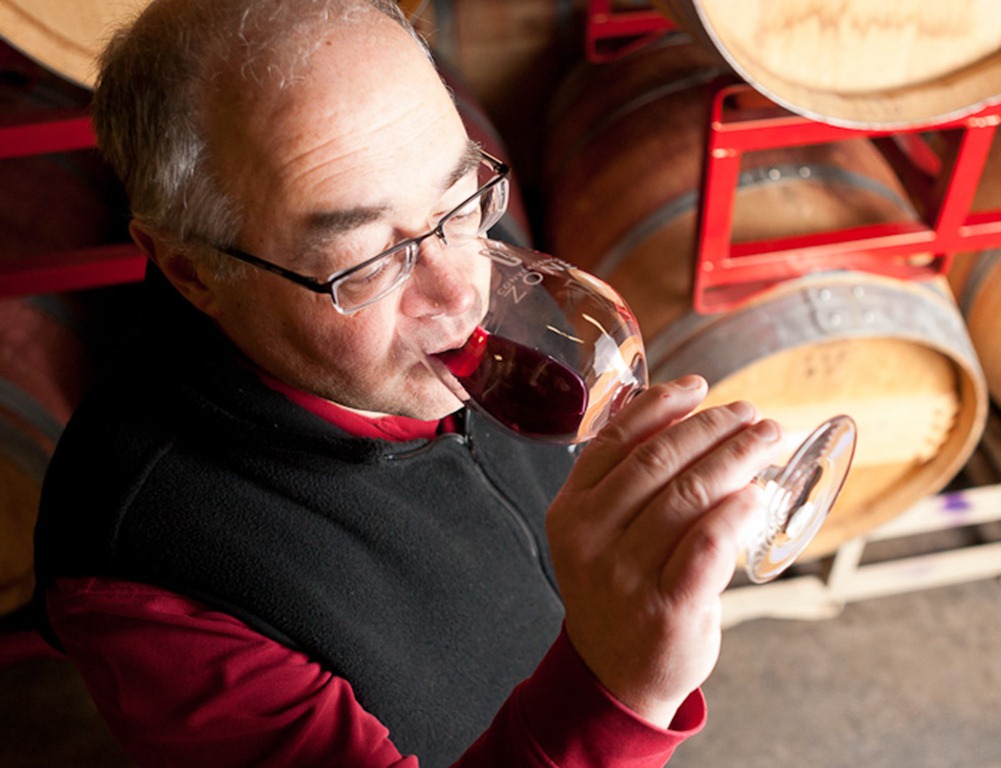
My first environmental portrait shoot was with Scott Greenberg of Convergence Zone cellars. We got connected via a mutual friend who saw my plea on Facebook for ideas of people to shoot. He very graciously agreed to a portrait session at his winery in exchange for the final images. It was a great shoot. I brought a single flash, a softbox, and a light stand, and we spent about 90 minutes working various poses around the winery. Here’s the one image that wound up in my final assignment submission:

Tasting a new Cabernet Sauvignon on Friday, Jan. 20, 2012, winemaker Scott Greenberg of Convergence Zone Cellars in Woodinville, WA, checks for different flavour profiles as the wine develops. This vintage, placed into barrels in November 2011, has hints of plum flavour and will age at least two more years before bottling. (Photo/Neil Enns)
Not bad overall! A different perspective, it’s clear that he’s involved in the wine business, and the barrels behind him are nicely placed.
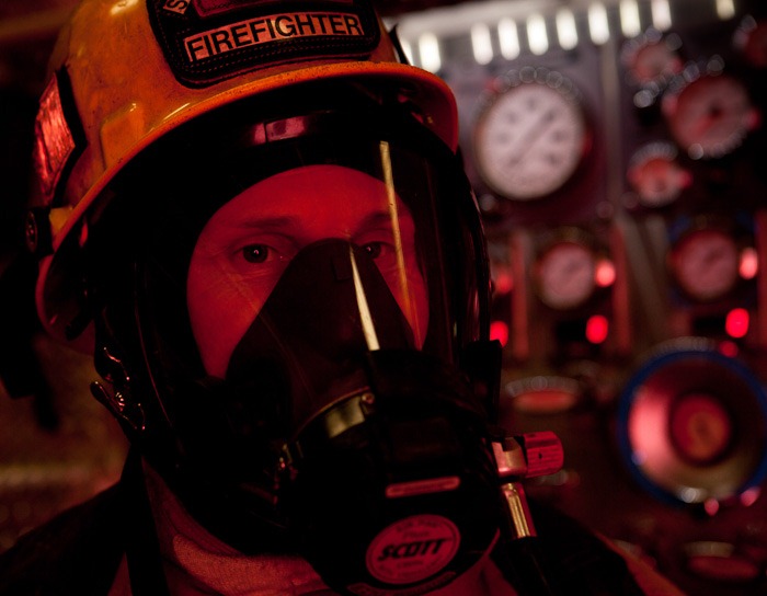
My second environmental portrait came after several weeks of waiting and hoping for access to my local fire station, Fire District 7 Station 72. After several email exchanges they agreed to a brief shoot on a Tuesday evening, one day before the assignment was due. I took my flash, a red gel, a light stand, and went to get a photo of a firefighter in a mask. I submitted this:

Standing in front of a fire engine in Snohomish, WA, on Wednesday, Jan. 25, 2012, firefighter/EMT Matt Nutterbrock is dressed in full protective gear. Nutterbrock is a three year veteran of the department, based at Station 72, headquarters for Snohomish County Fire District 7. (Photo/Neil Enns)
The shoot at the fire station taught me some important lessons:
- If you are going to use gels for creative effect, make sure you get some shots with and without the gel. I didn’t, and during class people did want to see what this looked like without the red effect.
- Don’t be afraid to ask people to do things. I did a reasonably good job of that during this shoot: he’s wearing a mask and the lights are on behind him because I asked for that. However, had I been more directed in my requests I would have had a higher number of good images to pick from.
As happy as I was with this photo, it wasn’t particularly well-received in class. People complained that it was cropped in too tight, and it was difficult to tell what was going on.
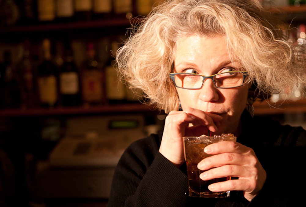
The two personality portraits were a little easier. The first is Colleen, our bartender on Monday nights at the curling club. Again I brought a flash and a light stand, directed her a bit on how to pose, and got this:

Sipping a non-alcoholic beverage, Colleen Richardson takes a break while bartending at the Granite Curling Club in Seattle, WA, on Monday, Jan. 23, 2012. A volunteer, Richardson has been the Monday League bartender for the past three years. (Photo/Neil Enns).
Colleen loved the photo, and it completely captures her fun spirit. The second personality portrait was definitely my weakest photo in the assignment:

Watching his bubble, Eddie Blunt brightens a dreary day in Everett, WA, on Sunday, Jan. 22, 2012. Blunt’s favourite location to practice his craft is outside Providence Children’s Center in downtown Everett, which he says gives him "the most bang" for each bubble. (Photo/Neil Enns)
It’s just… eh. But it was the best of what I had, so in it went.
Overall for this assignment I count nine separate portrait sessions to get the final four images. I told you in earlier posts this class wound up being a lot of work!
(Yes, this post is lengthy. I’m not sure if they’ll all wind up this long, but to quote Jerry Blank: “I’ve got something to say!”)
Our first assignment seemed simple: submit two photos that cover any two of the standard categories of news photography (general news, spot news, feature, sports action, or sports feature). We also had to put Associated Press-style captions on every image, and that included getting names from people in the photos.
Two photos!? That’s it? Easy as pie right? Uh, no. Especially if you want to turn in good photos.
There were two things hard about this assignment: determining what to shoot, and finding images that weren’t boring.
For what to shoot, I brainstormed a bit with Shan and eventually settled on trying to get into the Seattle Wedding Show for some general news photos and shots of the Light Rail No Pants 2012 ride.
On a rainy Sunday I packed up all my gear, headed to downtown Seattle, showed up at the convention center, and asked at the media booth for a pass to get in.
Denied. “You aren’t press, and no photography is allowed at the show unless you are press”. This would prove to be a regular occurrence during the class. Being a student in an editorial photography class is not the same as being an editorial photographer, and many places were quite happy to point out that distinction. Sigh.
I almost decided to turn around and go home but since I was downtown anyway I figured I’d walk around and see if something came up. Lucky me! I came across a vigil for victims of gun violence (I didn’t know it but that day was the anniversary of the Gabby Giffords shooting). Even better, there were people at the vigil packing heat! Members of the Washington Gun Rights association were standing there quietly with handguns on their hips. “Photo gold”, I thought! I photographed a whole bunch, chatted a bit with Erika Shultz, and left feeling really good.
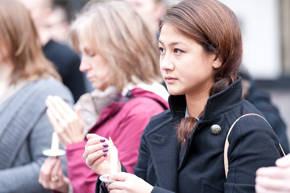
Unfortunately the photos missed the mark. That one shoot made it abundantly clear to me that editorial photography is hard. Here is one example of a photo that didn’t work:

Protecting her candle, Odessa Stevens, a Washington Cease Fire board member, participates in a vigil remembering victims of gun violence at Westlake Park in Seattle, WA on Sunday, Jan. 8, 2012. Washington Cease Fire was founded in 1983 and works to reduce gun violence in communities across Washington State. (Photo/Neil Enns)
The photo is just a lady with a candle. It’s totally missing the context of the vigil. For an example that does work, check out the image that Erika captured for the Seattle Times.
The one success of the event was the practice I gained in asking people for names. I found people were very willing to provide names when asked (except for the guys with guns!). That actually proved true through every assignment and is something I will continue to do with all my editorial work going forward. Note to others: ask for names. It’s not that hard, and people almost always say yes!
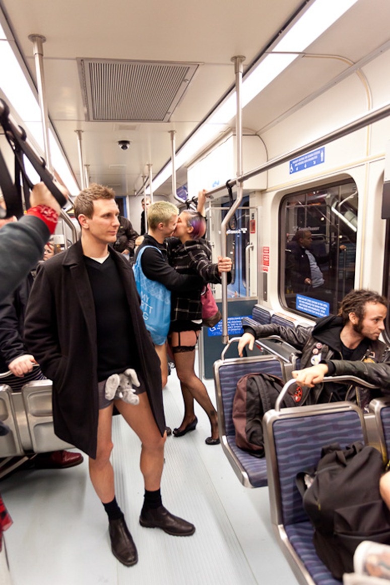
The No Pants 2012 ride was far more successful. I wound up with several solid images, had fun chatting with participants, and got one of the two final images for the assignment:

Kissing couple Derek Covey and Amber Haworth ride a SoundTransit train during No Pants Light Rail day in Seattle on Sunday, Jan. 8, 2012. In its third year in Seattle, No Pants Subway rides were started 10 years ago in New York City by Improv Everywhere. (Photo/Neil Enns)
I knew from looking of photos of prior No Pants rides online that it would be easy to get images of people without pants on, but hard to find something that showed an unusual situation or moment. When Derek and Amber kissed towards the very end of the event I quickly grabbed this shot and knew I had a winner. It’s not my favourite composition (I’m not wild about the amount of space at the top), but the elephant underwear, the guy looking away, and the kiss all combine to make a photo that’s definitely unusual.
My second photo for the class was a bit of a cop-out. I had a curling game on Monday night and knew I could take my gear to get some sort of sports action shot. My challenge was to get something that wasn’t the same boring shot of someone sweeping or a skip yelling.
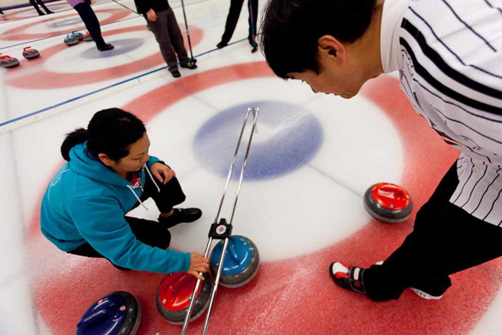
After shooting during the evening’s early games I was sitting in the bar, unhappy with the images I had, when I noticed a rock measure about to take place on sheet 2. I ran down the stairs with my camera, raced onto the ice, and got this:

Measuring her stone, Kris Ikegami of Team Schreiber confirms red is shot rock while Thomas Brandt of Team Gale-Seixeiro observes at the Granite Curling Club in Seattle on Monday, Jan. 9, 2012 during round one of Monday League playoffs. Founded in 1961 the Granite Curling Club is home to more national champions than any other curling club in the United States. (Photo/Neil Enns)
The photo makes me happy. It’s an unusual view of a curling game that most photographers can’t capture. You have to be there, know the club, and get out on the ice to capture the moment. Shooting from the sidelines or the rink end just won’t cut it.
So that was assignment one. Two photos from three different locations (four if you count the wedding show attempt).
The next assignments did not get easier!
For the past 10 weeks I’ve been taking a class in Assignment and Editorial Photography through the Photographic Center Northwest in Seattle, WA. I take PCNW classes when I believe the class will be fun and interesting, and since my work last year with the Seattle Storm was essentially editorial work I figured a proper class in it might teach me a thing or two.
Little did I know what I was in for.
On the very first day Matthew Williams, our instructor, gave us a syllabus that said: “This is a challenging class, requiring 5-10 hours per week of out of class time for shooting, editing, reading,
writing, and research”.
I scoffed. After all, the last time I spent anywhere near that amount of time on individual assignments was Modern Algebra with Dr Roddy something like 16 years ago during my undergraduate degree. Now that was a hard class!
I shouldn’t have scoffed. Matthew was right.
From a work standpoint the class easily surpassed Modern Algebra. It even required more time on assignments than Black and White III. The work was different than B&WIII too: the assignments were challenging, as opposed to B&W3 where it was simply drudgery (I had problems with sprocket hole streaking, but that’s a story for another blog entry…)
I originally intended to blog about each assignment as they happened but they wound up being so much work I really didn’t have the time or desire to write anything up. Now that the class is over I’m going to make up for it with a series of posts about each assignment.
Before heading off into the per-assignment posts, I do need to give a big thank you to three people who really played a key role in my success in the class: Shan, Tory, and Sabrina. All three provided regular critique and feedback on my photos throughout the class, and were valued partners in ensuring my work was as good as possible prior to turning it in to Matthew. Thanks ladies!
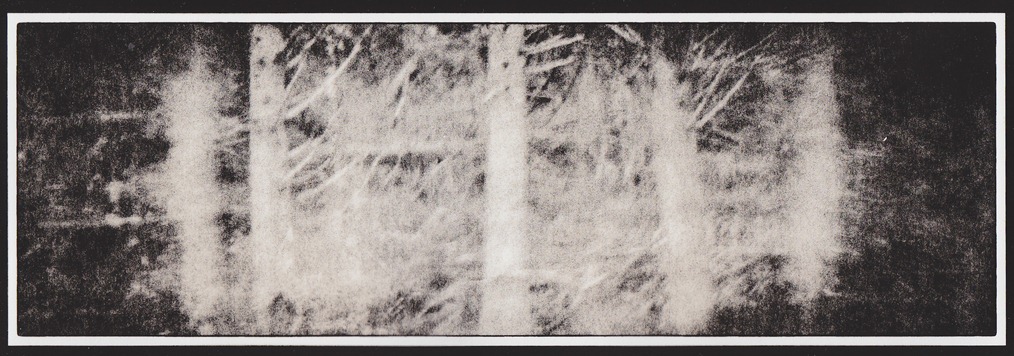
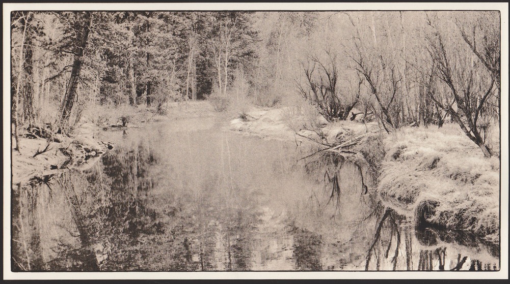
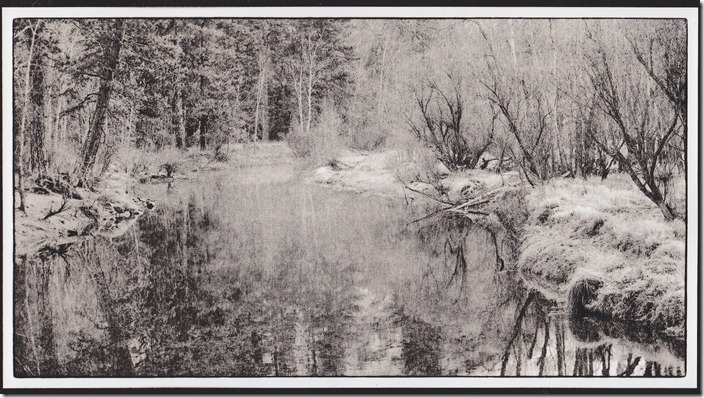
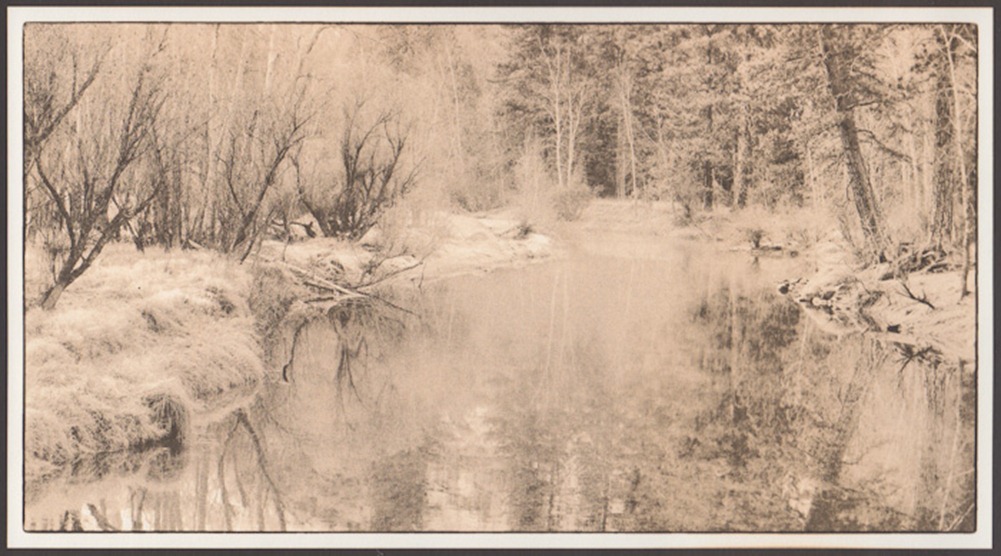
Tim Rudman says that Slavich Unibrom paper is “by far the most graphic and the coldest of all lithable papers with a look all of its own”. I agree.
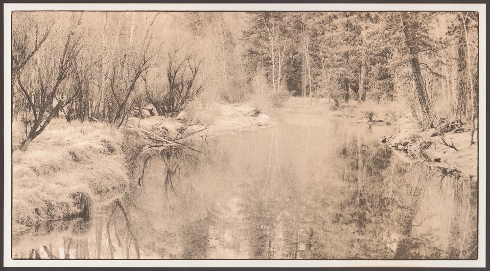
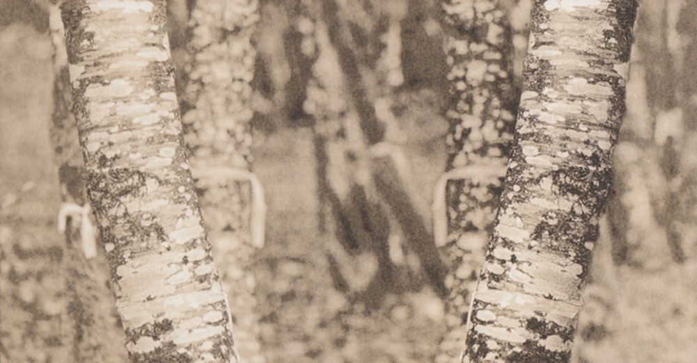
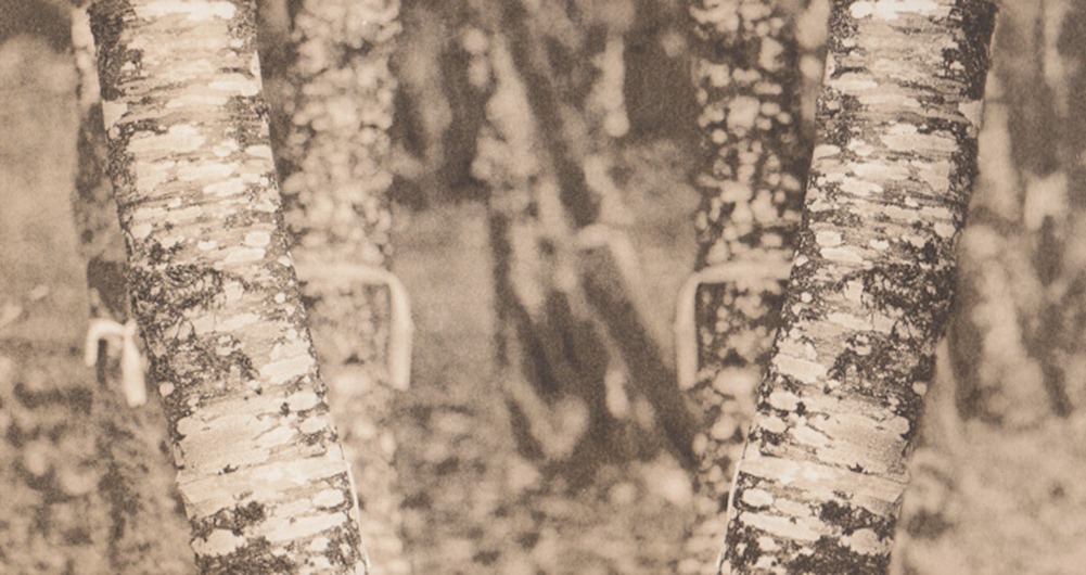
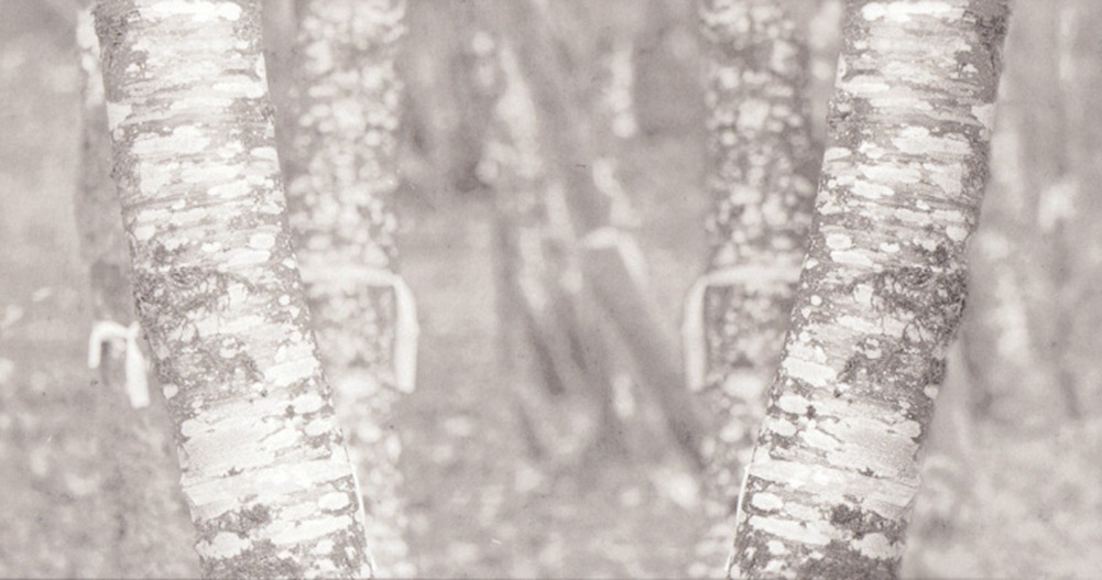
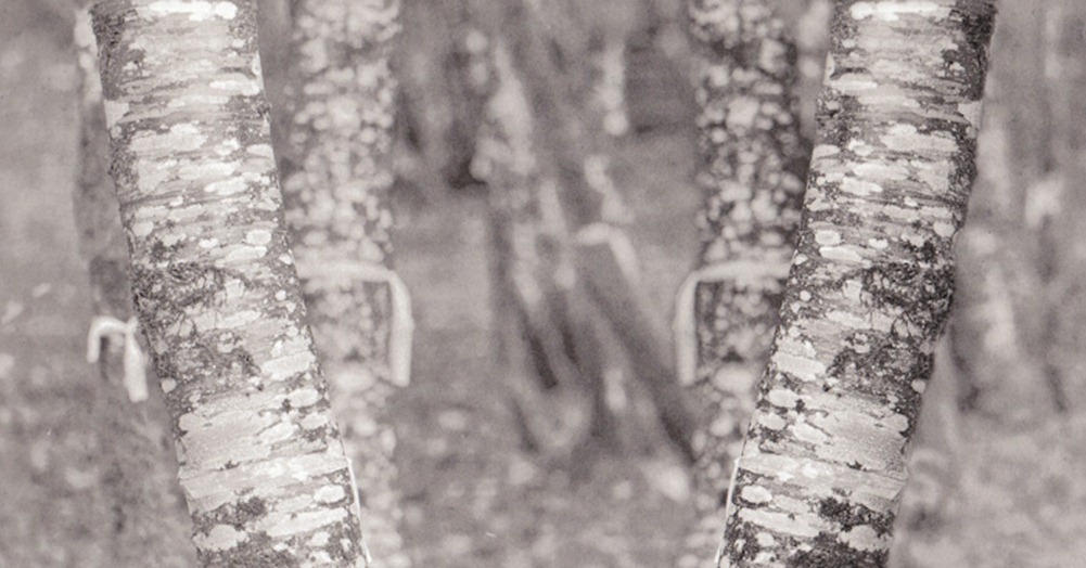
I played with the paper a bit using the Merced River shot (see the last image in my previous post), but really wanted to try it out with an unusual lensbaby image that’s in rotation on the front page of my photography website. Unfortunately I didn’t have time to do more than a single test print using the Fomatone and Adox curves, but still, I got results.

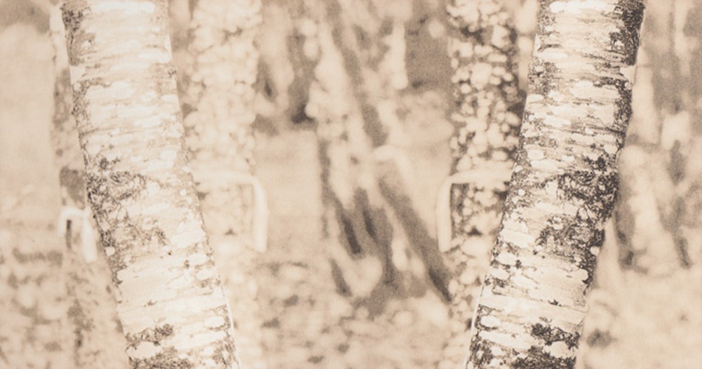
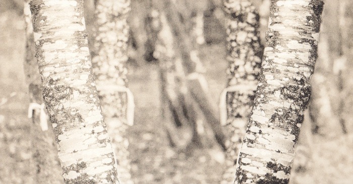
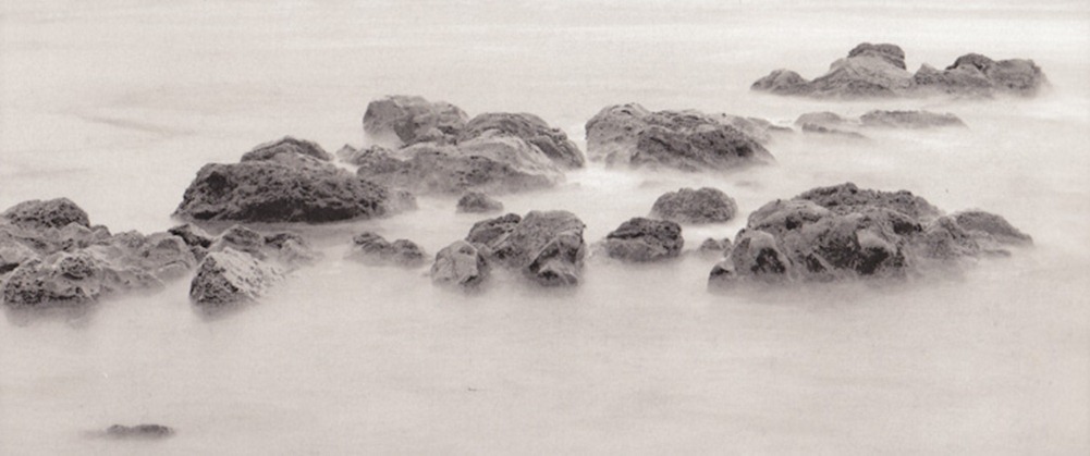
Slavich Unibrom 160 Grade 3 in Rollei Lith developer (100/100/1800). Fomatone curve. Exposure: 150 sec. @ f/5.6. Development: 8:48 Print #7.

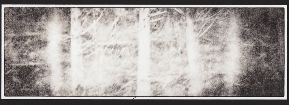
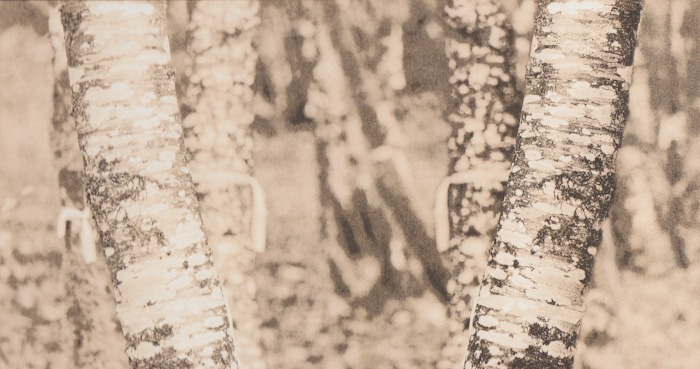
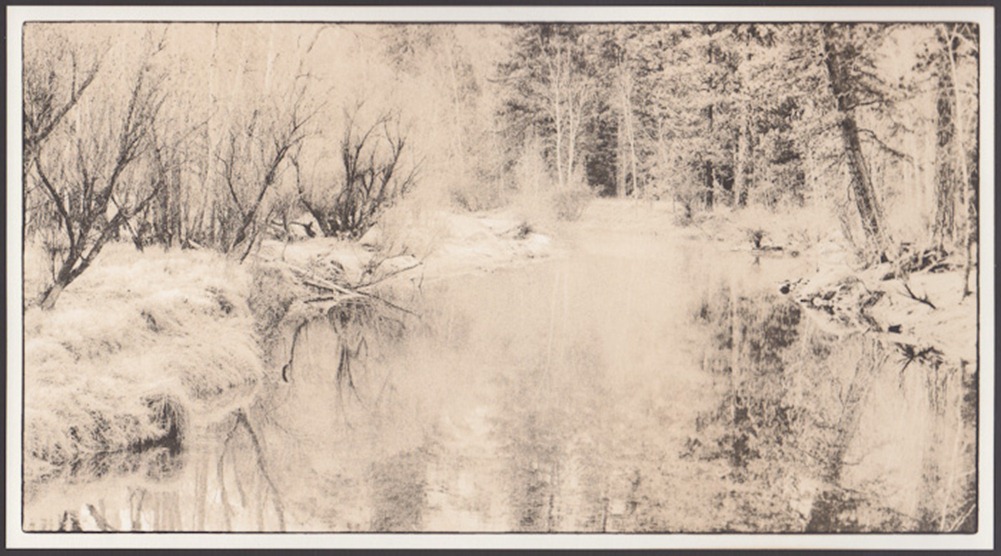
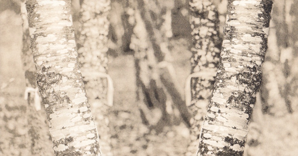
Slavich Unibrom 160 Grade 3 in Rollei Lith developer (100/100/2400). Adox curve. Exposure: 150 sec. @ f/5.6. Development: 8:48 Print #7.
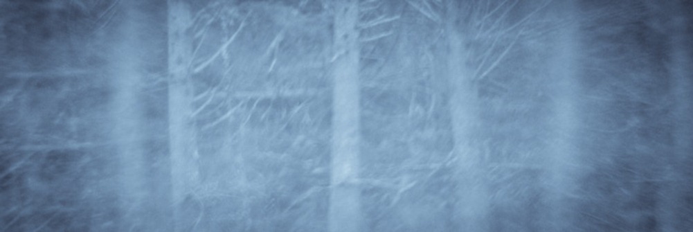
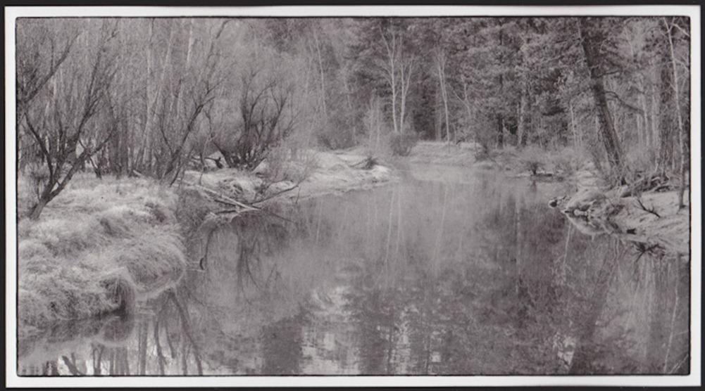
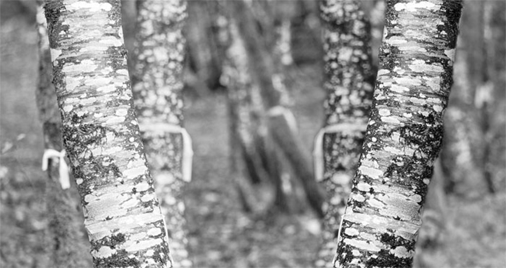
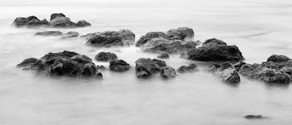
For reference here’s my original digital interpretation:

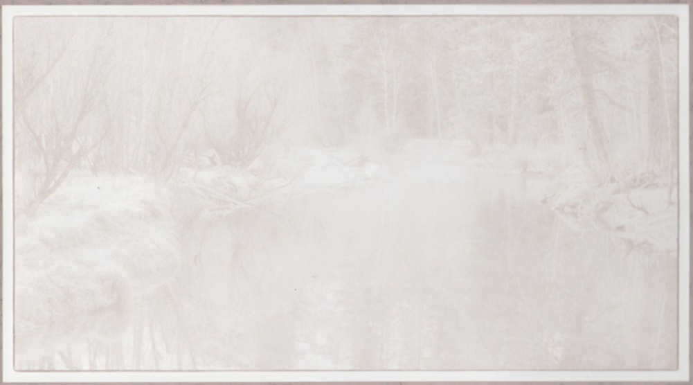
The two lith images side-by-side are a useful example of how much getting the curve right matters for digital negatives process. Both images were printed on the exact same sheet of paper in the same developer bath. The only difference is the adjustment curve applied to the image prior to printing.
Why did I use a Fomatone and Adox curve on Unibrom paper? Because I hadn’t built the curve yet for Unibrom, so I used what I had handy. I figured it would be close enough to get something interesting.
I did about three hours more lith printing with Tory today. Rather than write again about all the different permutations, exposure times, etc. I thought it would be more interesting to show the results of a week’s worth of work using the same image with seven different paper/dilution combinations. It’s a great way to see the variety possible with lith!

Fomatone Classic VC Warmtone in Arista Lith developer (100/100/3600). Fomatone curve. Exposure: 160 sec. @ f/5.6 Development: 8:39. Print #7.

Fomatone Classic VC Warmtone in Arista Lith developer (100/100/3600). Fomatone curve. Exposure: 160 sec. @ f/8 Development: 13:13. Print #8.

Adox MCC110 in Arista Lith Developer (100/100/3600). Adox curve. Exposure: 100 sec. @ f/8. Development: 35:00. Print #1.

Oriental Seagull VC-FB II Warmtone in Arista Lith developer (50/50/1900). Fomatone curve. Exposure: 180 sec. @ f/5.6. Development: 12:35. Print #1.

Oriental Seagull VC-FB II Warmtone in Rollei Lith developer (100/100/2400). Fomatone curve. Exposure: 180 sec. @ f/5.6. Development: 5:07 Print #5.

Fomatone Classic VC Warmtone in Rollei Lith developer (100/100/2400). Fomatone curve. Exposure: 90 sec. @ f/5.6. Development: 6:35. Print #6.

Slavich Unibrom 160 Grade 3 in Rollei Lith developer (100/100/1800). Fomatone curve. Exposure: 150 sec. @ f/5.6. Development: 6:10 Print #3.
Clicking on any of the above images will open a higher resolution version so you can look at how wildly different the shadow texture is between each variation.
Yesterday I spent most of the afternoon at PCNW lith printing. The first thing I wanted to figure out is what dilution developer would give reasonably longer development times for the Fomatone paper.
Image One
I started with a base 1:1:18 dilution of the developer, as recommended on a couple of online forums. Here’s the resulting image:

Fomatone Classic VC Warmtone in Arista Lith developer (100/100/1800). Fomatone curve. Exposure: 160 sec. @ f/5.6. Development: 3:59. Print #1.
Notice the development time was still 3:59. The day before in 1.5:1.5:1800 the exposure time was 3:29, so this admittedly small change in ratio only gave a 30 second difference in development. Rather than spend a ton of time futzing around I decided to go big or go home and dumped in an additional 1800ml of water, resulting in a 1:1:36 ratio.

Fomatone Classic VC Warmtone in Arista Lith developer (100/100/3600). Fomatone curve. Exposure: 160 sec. @ f/5.6. Development: 7:32. Print #2.
Ok, now the development time seems more lithy. It’s a little tough to tell in the scan but the shadows are a smidge more interesting and the highlights have even more pink. Seems like a reasonable dilution to work with. After printing a wheat image (more on that in a moment) I came back to this photo to fine tune the highlights. Here are the last two prints I made of it:

Fomatone Classic VC Warmtone in Arista Lith developer (100/100/3600). Fomatone curve. Exposure: 160 sec. @ f/8. Development: 7:52. Print #4.

Fomatone Classic VC Warmtone in Arista Lith developer (100/100/3600). Fomatone curve. Exposure: 240 sec. @ f/8 Development: 7:44. Print #5.
Notice how across all three images the shadows have essentially the same look and have very similar development times, but the highlights vary wildly. Why? The amount of exposure time under the enlarger. Using f-stop adjusted times, the top one is 320 seconds, the second is 160 seconds, and the third is 240 seconds. This is the beauty of lith: you control your highlights through exposure time, and shadows through development time.
For the record, I like the last version the best (240 sec. @ f/8).
Image Two
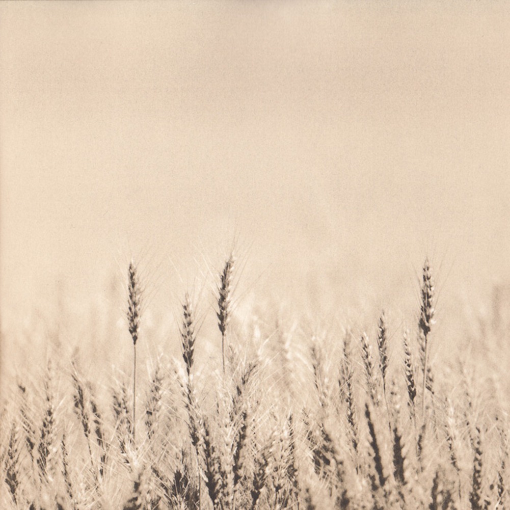
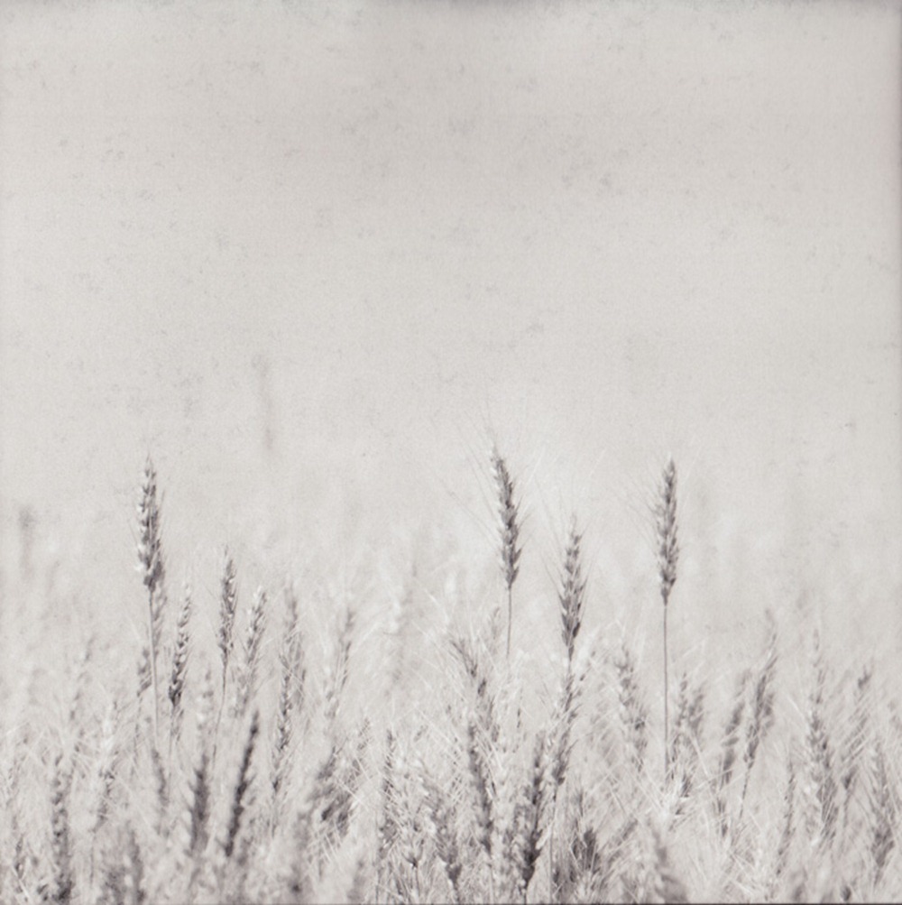
In between printing the trees I took a quick diversion to print a picture of some wheat from the Palouse region of Washington (which I’ve previously printed on canvas and as a salt print).

Fomatone Classic VC Warmtone in Arista Lith developer (100/100/3600). Fomatone curve. Exposure: 160 sec. @ f/5.6. Development: 7:41ish. Print #3.
I was totally happy with this and didn’t bother to spend any more time on it. Notice that across all the above images the development time is staying roughly constant at around 7:45, even as the image being printed changes. I love digital negatives.
Image Three
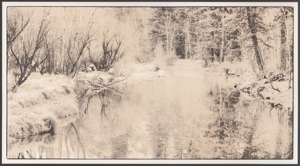
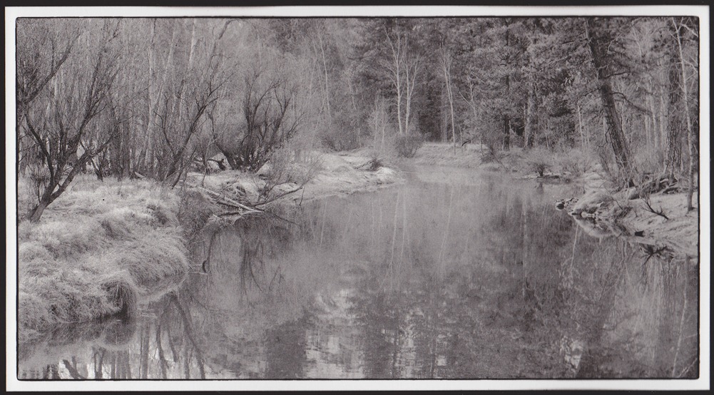
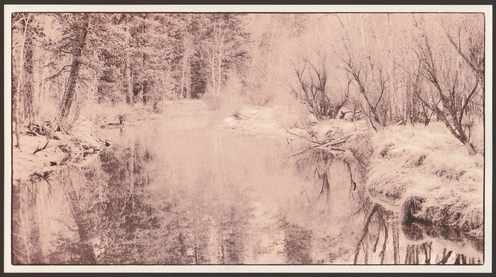
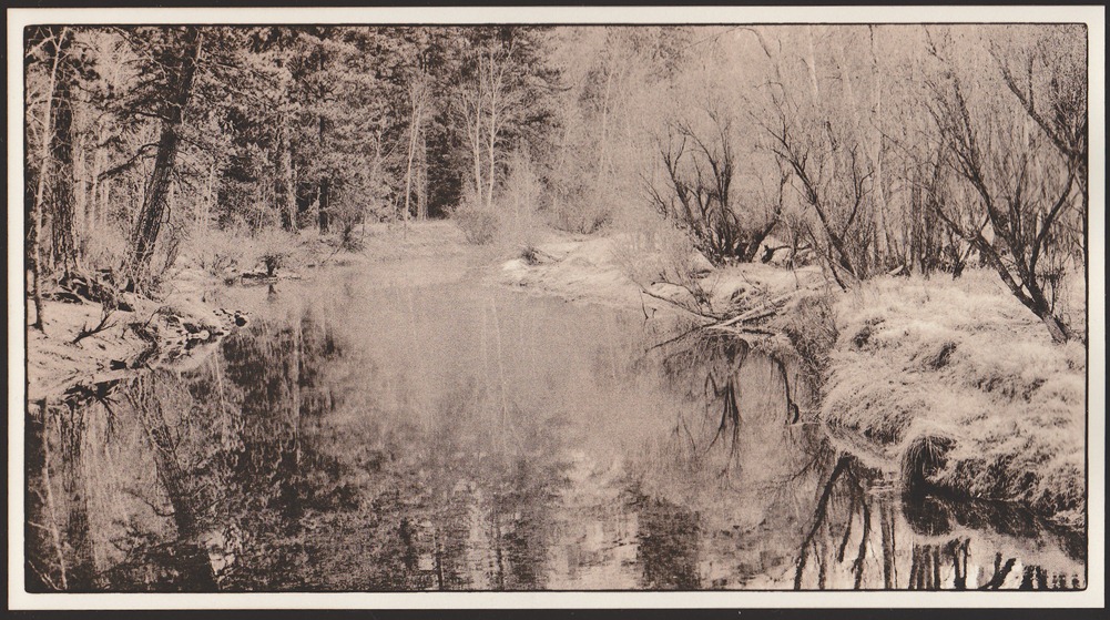
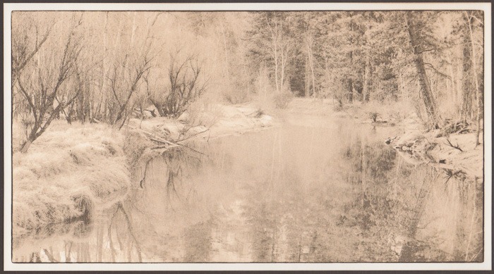
The last image I tried to print came from a recent trip to Yosemite National Park. Here’s the three versions on Fomatone paper:

Fomatone Classic VC Warmtone in Arista Lith developer (100/100/3600). Fomatone curve. Exposure: 160 sec. @ f/5.6 Development: 7:27. Print #6.

Fomatone Classic VC Warmtone in Arista Lith developer (100/100/3600). Fomatone curve. Exposure: 160 sec. @ f/5.6 Development: 8:39. Print #7.

Fomatone Classic VC Warmtone in Arista Lith developer (100/100/3600). Fomatone curve. Exposure: 160 sec. @ f/8 Development: 13:13. Print #8.
The first of these three was pretty good out of the tray, but I didn’t develop it long enough and the shadows are kind of blah. A second round with longer development gave better shadows, but I wasn’t wild about how dark the highlights were. The third one I backed off on exposure to get brighter highlights, and tried to keep the shadows the same.
If you look closely at the development times, however, you’ll notice something interesting. Instead of being right around 7:45, the progression is 7:27, 8:39, and 13:13 (!!!). What’s going on? Well, remember this is developer diluted 1:1:36, which is pretty weak. The 8th print through the developer and it’s basically run out of gas. The nice thing is the print looks AWESOME, with beautiful tones and really chunky shadows. The downside? That’s about all the developer could do.
But what about the Adox?
Just for, uh, fun, I decided to try printing the same image using the Adox paper in the basically-done developer. If you recall from the previous blog entry, Adox developed much slower than the Fomatone.

Adox MCC110 in Arista Lith Developer (100/100/3600). Adox curve. Exposure: 100 sec. @ f/8. Development: 35:00. Print #9.
No, your screen isn’t broken, and yes, you read that right: 35 minutes of development time. 35 minutes of sitting and listening to NPR while agitating a tray with 4L of water in it. And that was the result. Siiiigh.
I didn’t want to give up so I mixed up a new batch of stronger developer: 1:1:18 with an additional 1 part of “old brown” from the previous batch. Here’s the two images I processed with that mixture:

Adox MCC110 in Arista Lith Developer (100/100/3600). Adox curve. Exposure: 100 sec. @ f/8. Development: 35:00. Print #1.

Adox MCC110 in Arista Lith Developer (100/100/1800 + 100 old brown). Adox curve. Exposure: 100 sec. @ f/8. Development: 15:11. Print #2.
Eh. The first one is fine but doesn’t really look “lith”. The second one had very uneven development in the highlight areas, just like Tory saw on her wheat image.
Lessons Learned
- Fomatone MC Classic Warmtone in Arista at 1:1:36 is pretty darn cool.
- 4L of water is very heavy and sucks to agitate for long periods of time.
As I mentioned earlier this week I planned on lith printing today with Tory. We did. We went to PCNW with some digital negatives I printed out this morning based on the curves calculated earlier this week to see what would happen.
My expectations were pretty low. I’ve only done this once before with digital negatives and I wasn’t super impressed with the results. This time around I had different paper and different developer.
Wow.
The results far exceeded my expectations. It only took two tries to start reliably producing interesting results. I took four images to try out but only had time to do two of them. Here’s how each turned out.
Image One
Here is the original digital image I used, prior to applying the curve adjustments for the digital negative:

I put the “digital” part of digital negative to work on this one. The original colour image was processed twice in Silver Efex Pro 2.0. One pass was to do the background of the image, and the second was deal with the two trees on the right. I then did a layer mask to blend the two versions together. Try doing that with an enlarger!
Here’s the first lith print of the above image:

Adox MCC110 in Arista Lith. Dilution: 100/100/1800. Exposure: 100 sec. @ f/8. Development: 13:31. Print #1.
Yes, the highlights don’t have enough detail. And yes, the shadows aren’t dark enough. But it’s close. Tory and I were very excited at this point since it was proof the curves were roughly right and the whole process was right.
To fix the highlights I doubled my exposure on the next print, and to fix the shadows we added a bit more developer to the water since we really didn’t want to do 16+ minute development times. Here’s the second print:

Adox MCC110 in Arista Lith. Dilution: 150/150/1800. Exposure: 200 sec. @ f/8. Development: 10:45. Print #3.
Notice how much better the highlights and shadows are! In particular, notice how much darker the shadows are even though the development time is almost 3 minutes shorter. Amazing what changing the dilution from 1:1:18 to 1.5:1.5:18 does. At this point I was incredibly happy with the photo and moved on to trying the same image with the Fomatone paper.

Fomatone VC Warmtone in Arista Lith. Dilution: 150/150/1800. Exposure: 320 sec. @ f/8. Development: 3:29. Print #5.
Before talking about the numbers, I should point out that I screwed this print up. I accidentally printed with my Adox digital negative so it had the wrong curve applied for this paper. The print actually isn’t that bad, but the highlights aren’t very good.
Notice how much longer the exposure has to be for the Fomatone paper. It’s almost six minutes! And notice how incredibly short the development time is for lith. At 3:29, it’s almost the same length as a regular silver printing process. We didn’t have time, but I’d like to go back and try this paper again in a higher dilution developer. Maybe 1:1:18 or even (*gasp*) 1:1:36.
When I realized I used the wrong negative I quickly ran another print using the same exposure time and the proper negative, to see if it would fix the highlights. Here’s the result:

Fomatone VC Warmtone in Arista Lith. Dilution: 150/150/1800. Exposure: 320 sec. @ f/8. Development: 3:29. Print #7.
Much better! It is pure luck that I pulled this print at exactly the same time as the previous one. Of all the versions of this image I printed today I like this one the best.
Image Two
At this point in the day we’d been in the darkroom for about 2.5 hours and my feet were starting to hurt. I couldn’t resist trying one more image though. Here’s the original digital version, processed in Silver Efex Pro 2.0:

And here’s the one lith print I managed to get done:

Adox MCC110 in Arista Lith. Dilution: 150/150/1800. Exposure: 200 sec. @ f/8. Development: 13:03. Print #9.
Pretty cool! I think I pulled it a little too soon as I’d like to see the shadows a bit darker. And I hate the little rock in the lower left. But that’s an easy fix: I can just clone it out in Photoshop and re-print the negative. AWESOME.
Summary
It worked. It was a ton of fun. I want to go do it again. Other things I learned:
- The Fomatone develops vastly faster in the Arista lith developer than the Adox paper.
- The Fomatone develops in very, very, yellow/green, in the Arista developer at the dilution we were using.
- The Fomatone takes forever to expose under the enlarger. Next time, f/5.6!
- I love the cream coloured highlights of the Adox paper.
When we were there we also got to see some lith prints by Gina on a new paper from Ilford. They looked amazing, so I have another paper to try!
P.S. If you’re wondering what the “Print #” thing is under each image, that’s the order of that particular print in the developer. Since Tory and I were alternating in the same developer tray, I got all the odd numbered prints. We did that so we could, in theory, track changes in development time and look of the images as each print went through the process, but we didn’t stay long enough to really enough data points for that.
