Tim Rudman says that Slavich Unibrom paper is “by far the most graphic and the coldest of all lithable papers with a look all of its own”. I agree.
I played with the paper a bit using the Merced River shot (see the last image in my previous post), but really wanted to try it out with an unusual lensbaby image that’s in rotation on the front page of my photography website. Unfortunately I didn’t have time to do more than a single test print using the Fomatone and Adox curves, but still, I got results.
For reference here’s my original digital interpretation:
The two lith images side-by-side are a useful example of how much getting the curve right matters for digital negatives process. Both images were printed on the exact same sheet of paper in the same developer bath. The only difference is the adjustment curve applied to the image prior to printing.
Why did I use a Fomatone and Adox curve on Unibrom paper? Because I hadn’t built the curve yet for Unibrom, so I used what I had handy. I figured it would be close enough to get something interesting.
I did about three hours more lith printing with Tory today. Rather than write again about all the different permutations, exposure times, etc. I thought it would be more interesting to show the results of a week’s worth of work using the same image with seven different paper/dilution combinations. It’s a great way to see the variety possible with lith!
Fomatone Classic VC Warmtone in Arista Lith developer (100/100/3600). Fomatone curve. Exposure: 160 sec. @ f/5.6 Development: 8:39. Print #7.
Fomatone Classic VC Warmtone in Arista Lith developer (100/100/3600). Fomatone curve. Exposure: 160 sec. @ f/8 Development: 13:13. Print #8.
Adox MCC110 in Arista Lith Developer (100/100/3600). Adox curve. Exposure: 100 sec. @ f/8. Development: 35:00. Print #1.
Oriental Seagull VC-FB II Warmtone in Arista Lith developer (50/50/1900). Fomatone curve. Exposure: 180 sec. @ f/5.6. Development: 12:35. Print #1.
Oriental Seagull VC-FB II Warmtone in Rollei Lith developer (100/100/2400). Fomatone curve. Exposure: 180 sec. @ f/5.6. Development: 5:07 Print #5.
Fomatone Classic VC Warmtone in Rollei Lith developer (100/100/2400). Fomatone curve. Exposure: 90 sec. @ f/5.6. Development: 6:35. Print #6.
Clicking on any of the above images will open a higher resolution version so you can look at how wildly different the shadow texture is between each variation.
Yesterday I spent most of the afternoon at PCNW lith printing. The first thing I wanted to figure out is what dilution developer would give reasonably longer development times for the Fomatone paper.
Image One
I started with a base 1:1:18 dilution of the developer, as recommended on a couple of online forums. Here’s the resulting image:
Fomatone Classic VC Warmtone in Arista Lith developer (100/100/1800). Fomatone curve. Exposure: 160 sec. @ f/5.6. Development: 3:59. Print #1.
Notice the development time was still 3:59. The day before in 1.5:1.5:1800 the exposure time was 3:29, so this admittedly small change in ratio only gave a 30 second difference in development. Rather than spend a ton of time futzing around I decided to go big or go home and dumped in an additional 1800ml of water, resulting in a 1:1:36 ratio.
Fomatone Classic VC Warmtone in Arista Lith developer (100/100/3600). Fomatone curve. Exposure: 160 sec. @ f/5.6. Development: 7:32. Print #2.
Ok, now the development time seems more lithy. It’s a little tough to tell in the scan but the shadows are a smidge more interesting and the highlights have even more pink. Seems like a reasonable dilution to work with. After printing a wheat image (more on that in a moment) I came back to this photo to fine tune the highlights. Here are the last two prints I made of it:
Fomatone Classic VC Warmtone in Arista Lith developer (100/100/3600). Fomatone curve. Exposure: 160 sec. @ f/8. Development: 7:52. Print #4.
Fomatone Classic VC Warmtone in Arista Lith developer (100/100/3600). Fomatone curve. Exposure: 240 sec. @ f/8 Development: 7:44. Print #5.
Notice how across all three images the shadows have essentially the same look and have very similar development times, but the highlights vary wildly. Why? The amount of exposure time under the enlarger. Using f-stop adjusted times, the top one is 320 seconds, the second is 160 seconds, and the third is 240 seconds. This is the beauty of lith: you control your highlights through exposure time, and shadows through development time.
For the record, I like the last version the best (240 sec. @ f/8).
Image Two
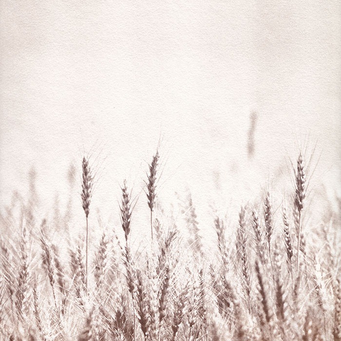
In between printing the trees I took a quick diversion to print a picture of some wheat from the Palouse region of Washington (which I’ve previously printed on canvas and as a salt print).
Fomatone Classic VC Warmtone in Arista Lith developer (100/100/3600). Fomatone curve. Exposure: 160 sec. @ f/5.6. Development: 7:41ish. Print #3.
I was totally happy with this and didn’t bother to spend any more time on it. Notice that across all the above images the development time is staying roughly constant at around 7:45, even as the image being printed changes. I love digital negatives.
Image Three
The last image I tried to print came from a recent trip to Yosemite National Park. Here’s the three versions on Fomatone paper:
Fomatone Classic VC Warmtone in Arista Lith developer (100/100/3600). Fomatone curve. Exposure: 160 sec. @ f/5.6 Development: 7:27. Print #6.
Fomatone Classic VC Warmtone in Arista Lith developer (100/100/3600). Fomatone curve. Exposure: 160 sec. @ f/5.6 Development: 8:39. Print #7.
Fomatone Classic VC Warmtone in Arista Lith developer (100/100/3600). Fomatone curve. Exposure: 160 sec. @ f/8 Development: 13:13. Print #8.
The first of these three was pretty good out of the tray, but I didn’t develop it long enough and the shadows are kind of blah. A second round with longer development gave better shadows, but I wasn’t wild about how dark the highlights were. The third one I backed off on exposure to get brighter highlights, and tried to keep the shadows the same.
If you look closely at the development times, however, you’ll notice something interesting. Instead of being right around 7:45, the progression is 7:27, 8:39, and 13:13 (!!!). What’s going on? Well, remember this is developer diluted 1:1:36, which is pretty weak. The 8th print through the developer and it’s basically run out of gas. The nice thing is the print looks AWESOME, with beautiful tones and really chunky shadows. The downside? That’s about all the developer could do.
But what about the Adox?
Just for, uh, fun, I decided to try printing the same image using the Adox paper in the basically-done developer. If you recall from the previous blog entry, Adox developed much slower than the Fomatone.
Adox MCC110 in Arista Lith Developer (100/100/3600). Adox curve. Exposure: 100 sec. @ f/8. Development: 35:00. Print #9.
No, your screen isn’t broken, and yes, you read that right: 35 minutes of development time. 35 minutes of sitting and listening to NPR while agitating a tray with 4L of water in it. And that was the result. Siiiigh.
I didn’t want to give up so I mixed up a new batch of stronger developer: 1:1:18 with an additional 1 part of “old brown” from the previous batch. Here’s the two images I processed with that mixture:
Adox MCC110 in Arista Lith Developer (100/100/3600). Adox curve. Exposure: 100 sec. @ f/8. Development: 35:00. Print #1.
Adox MCC110 in Arista Lith Developer (100/100/1800 + 100 old brown). Adox curve. Exposure: 100 sec. @ f/8. Development: 15:11. Print #2.
Eh. The first one is fine but doesn’t really look “lith”. The second one had very uneven development in the highlight areas, just like Tory saw on her wheat image.
Lessons Learned
Fomatone MC Classic Warmtone in Arista at 1:1:36 is pretty darn cool.
4L of water is very heavy and sucks to agitate for long periods of time.
As I mentioned earlier this week I planned on lith printing today with Tory. We did. We went to PCNW with some digital negatives I printed out this morning based on the curves calculated earlier this week to see what would happen.
My expectations were pretty low. I’ve only done this once before with digital negatives and I wasn’t super impressed with the results. This time around I had different paper and different developer.
Wow.
The results far exceeded my expectations. It only took two tries to start reliably producing interesting results. I took four images to try out but only had time to do two of them. Here’s how each turned out.
Image One
Here is the original digital image I used, prior to applying the curve adjustments for the digital negative:
I put the “digital” part of digital negative to work on this one. The original colour image was processed twice in Silver Efex Pro 2.0. One pass was to do the background of the image, and the second was deal with the two trees on the right. I then did a layer mask to blend the two versions together. Try doing that with an enlarger!
Here’s the first lith print of the above image:
Adox MCC110 in Arista Lith. Dilution: 100/100/1800. Exposure: 100 sec. @ f/8. Development: 13:31. Print #1.
Yes, the highlights don’t have enough detail. And yes, the shadows aren’t dark enough. But it’s close. Tory and I were very excited at this point since it was proof the curves were roughly right and the whole process was right.
To fix the highlights I doubled my exposure on the next print, and to fix the shadows we added a bit more developer to the water since we really didn’t want to do 16+ minute development times. Here’s the second print:
Adox MCC110 in Arista Lith. Dilution: 150/150/1800. Exposure: 200 sec. @ f/8. Development: 10:45. Print #3.
Notice how much better the highlights and shadows are! In particular, notice how much darker the shadows are even though the development time is almost 3 minutes shorter. Amazing what changing the dilution from 1:1:18 to 1.5:1.5:18 does. At this point I was incredibly happy with the photo and moved on to trying the same image with the Fomatone paper.
Fomatone VC Warmtone in Arista Lith. Dilution: 150/150/1800. Exposure: 320 sec. @ f/8. Development: 3:29. Print #5.
Before talking about the numbers, I should point out that I screwed this print up. I accidentally printed with my Adox digital negative so it had the wrong curve applied for this paper. The print actually isn’t that bad, but the highlights aren’t very good.
Notice how much longer the exposure has to be for the Fomatone paper. It’s almost six minutes! And notice how incredibly short the development time is for lith. At 3:29, it’s almost the same length as a regular silver printing process. We didn’t have time, but I’d like to go back and try this paper again in a higher dilution developer. Maybe 1:1:18 or even (*gasp*) 1:1:36.
When I realized I used the wrong negative I quickly ran another print using the same exposure time and the proper negative, to see if it would fix the highlights. Here’s the result:
Fomatone VC Warmtone in Arista Lith. Dilution: 150/150/1800. Exposure: 320 sec. @ f/8. Development: 3:29. Print #7.
Much better! It is pure luck that I pulled this print at exactly the same time as the previous one. Of all the versions of this image I printed today I like this one the best.
Image Two
At this point in the day we’d been in the darkroom for about 2.5 hours and my feet were starting to hurt. I couldn’t resist trying one more image though. Here’s the original digital version, processed in Silver Efex Pro 2.0:
And here’s the one lith print I managed to get done:
Adox MCC110 in Arista Lith. Dilution: 150/150/1800. Exposure: 200 sec. @ f/8. Development: 13:03. Print #9.
Pretty cool! I think I pulled it a little too soon as I’d like to see the shadows a bit darker. And I hate the little rock in the lower left. But that’s an easy fix: I can just clone it out in Photoshop and re-print the negative. AWESOME.
Summary
It worked. It was a ton of fun. I want to go do it again. Other things I learned:
The Fomatone develops vastly faster in the Arista lith developer than the Adox paper.
The Fomatone develops in very, very, yellow/green, in the Arista developer at the dilution we were using.
The Fomatone takes forever to expose under the enlarger. Next time, f/5.6!
I love the cream coloured highlights of the Adox paper.
When we were there we also got to see some lith prints by Gina on a new paper from Ilford. They looked amazing, so I have another paper to try!
P.S. If you’re wondering what the “Print #” thing is under each image, that’s the order of that particular print in the developer. Since Tory and I were alternating in the same developer tray, I got all the odd numbered prints. We did that so we could, in theory, track changes in development time and look of the images as each print went through the process, but we didn’t stay long enough to really enough data points for that.
On Wednesday I’m going to lith print for the first time in more than a year. Tory and I are going to PCNW to have some fun! Last time I did it I just grabbed a random curve off the web, applied it to my image, and tried on some old paper I had lying around. This time I’m trying to up the likelihood of success by adding some precision to the equation.
It starts with properly determining the standard print time using a Stouffer Step Wedge for a regular old gelatin silver print. Thankfully David had four 31-step wedges to lend me which made it quite a bit easier: I could expose four in one batch to save on multiple trips through the development solution.
Here’s the results for the two papers I plan on using, ADOX MCC110 and Fomatone MG Classic Warm Tone:
It’s pretty much impossible to tell in the web images, but at the time I figured the winnerwinnerchickendinner numbers were 25 seconds for the Adox and 40 seconds for the Fomatone. Amazing how different papers can have such different exposure times with everything else consistent!
With those numbers set I proceeded to do test prints of a ChartThrob greyscale calibration chart. The idea here is to figure out how differently the ink from my printer blocks light when compared to a traditional negative.
Here are scans of the resulting charts for the two papers:
Even at the smalls size you can see these aren’t so hot. It’s expected that there will be a whole lot of black squares in the bottom rows, just not so many of them. Here’s the resulting adjustment curves, as calculated by ChartThrob:
Most of the curve looks reasonable, but the really long ramp up on the left makes me think the originals were overexposed. You can see this in the scanned charts above too: almost half the chart is pure black. Based on what I’ve read I’d expect a few rows of pure black, but not that many.
It only took 45 minutes of time in the darkroom to do these tests (and another 20 doing the final wash!) so I think I’ll go back tomorrow and try again with slightly less exposure time and see what the resulting charts look like.
One other note: I also did some HSL RNP-Array tests to try and determine what ink colour I should be using, but I have to admit I have no idea how to interpret the results!
(This blog entry was originally guest-posted on Ron Martinsen’s photo blog, and was posted January 20th, 2011)
Ron once wrote the following in his second article in the Printing 101 series:
“[…] you might want to sketch out what your long-term goals are to ensure that you’ll have the space to accommodate it all. After all you’ll have an unhappy significant other when your studio becomes like mine where it is more of a mine field than a place of work due to all of the gear scattered around it!”
I laughed when I read that, because for the last year or so that’s been my print studio. Printing and photography gear was strewn everywhere, I could barely move to get to my workstation, and storage (despite the walls being lined with bookshelves) was non-existent. I was certainly able to make high quality prints for customers, but I wasn’t as productive as I could be and I certainly didn’t enjoy being in my office when I was printing.
In the fall of 2010 my wife and I embarked on a project to completely remodel our 23-year-old house. As part of that project I vowed that I would have a proper print studio when everything was over.
I’m happy to say that the remodel’s complete, I have a print studio, and I love it.
At Ron’s suggestion I thought I’d take everyone on a tour of the new space, and more importantly explain the design decisions I made and parts I used so you can incorporate some of the ideas into your own workspace.
The completed studio
Finding The Space
Even though we were remodeling the whole house my goal was to keep the expense of the studio part to a minimum. An addition just for a studio was out of the question so like many people I decided to convert one of the bedrooms over to a dedicated workspace.
Actual construction work was minimal: we removed the bedroom closet. That gave an additional 2 feet of depth to the room, for a total of 125 square feet to make my own. The carpet was removed and replaced with hardwood to make it easier to deal with dust. On the electrical side I had a dedicated 20 amp circuit installed along with a whole-house surge protector, and the ceiling lights were replaced with a square of Juno track (more on that later). I personally pulled Cat 6 and RG6 to multiple locations in the room for connectivity.
Keeping the construction costs low meant I could dump money into other things like storage, lighting, and of course more paper to print on!
The Printers
When the remodel started I only had one printer to worry about for the space: a Canon iPF5100. Of course that was before Canon started their big rebate program, and midway through the construction I became the proud owner of a new Canon iPF8300. It’s a little big. Actually, it’s a lot big.
The two printers live on opposite sides of the room. The 5100 is on some Ikea kitchen cabinets, and the 8300 is on its own stand.
The 8300 along the long wall of the room
The 5100 on the Ikea cabinets
Storage
My biggest pain in my old workspace was the complete lack of purpose-designed storage. I had walls of bookshelves which are great for books, but they’re rotten for camera gear and printing supplies. I knew from multiple discussions with Andy Biggs that proper paper storage and LOTS of flat workspace was critical to a successful print studio.
All of the storage in the studio is put together from Ikea’s Akrum line of kitchen cabinets. They’re (relatively) inexpensive and can be configured to give pretty much whatever storage you need. I designed the layout using Ikea’s Kitchen Planner software, many, many, many, times (I spent more than three months getting it perfect).
An almost-perfect layout for the studio. The big box in the top right is the Canon iPF8300. During install I made a few tweaks to the order of the cabinets along the bottom.
Even with the printers and such in the room I have over four feet of uninterrupted counter space for work. It’s already been hugely helpful when I’m packing up folio orders for shipping.
I’m still in the process of loading everything into the office and figuring out the best places to put things, but roughly speaking the drawers are for storing camera and framing gear, and the floor cabinets are for storing printing and packing supplies. Wall cabinets are for storing folio covers prior to shipping and the books I decide to keep in the studio instead of elsewhere in the house. Boxes of 17” wide roll paper go on top of the wall cabinets. Boxes of 24” and 40” rolls go on the floor under the window. Camera bags, tripods, and lighting gear go in the cabinet that sticks out under the iPF5100.
Total cost for all the cabinets was right around $1500.
Inside the primary paper storage cabinet. Yes, that’s B&W darkroom paper at the bottom!
Inside one of my lens drawers Most of my gear is still in storage from the remodel
Lighting
In my old office I’d personally replaced the lights with some basic track lighting and fixtures from Solux. In the new studio I wanted to make sure it was done right. I had an electrician come in and put a grid of Juno track around the entire room, 3’ off the wall. With Juno fixtures and 4700K 50w 36 degree bulbs from Solux I’ve got consistent and colour accurate lights in the whole space.
Of course putting light into the room is just one aspect of lighting a studio. Keeping light out is another. The only window in the office is covered with a custom top-down/bottom-up (TDBU) light-blocking cellular shade. With the TDBU design I can open the top of it a bit to let some natural light in while maintaining privacy, and when I need to do colour-accurate print work I can close the shade and keep all the stray light out. The shade cost $230 and was worth every penny.
Custom light-blocking window shade on the studio’s only window
Print Viewing
Another irritation in my old office was the complete lack of print viewing facilities. I basically had a folding table from Costco with a Solux fixture pointed straight down at it. Not exactly useful.
Conveniently, my friend Rob down in Berkeley, CA (owner of the mighty fine The Lightroom print studio) solved this problem for me when he figured out a way to display my folio covers prospective clients. By hanging a big piece of galvanized sheet metal on the wall you can make an instant print viewing booth.
My print viewing facilities
The metal is a 4×8’ piece of 24ga. galvanized steel from Metal Supermarkets, and only cost $55. The hanging system is Click Rail manufactured by AS Hanging Systems, using two pieces of wall track and four secure self-gripping hooks for earthquake protection. I purchased the rail and hooks from Frame Central locally, but if necessary the parts can be ordered directly from AS Hanging. Prints are attached to the board using pin magnets from Super Magnet Man. All told the setup cost less than $200 and can hold prints as tall as my iPF8300 can produce.
Lighting on the board is provided by four Solux fixtures, and I still have to dig out the light meter to do some fine-tuning for even coverage (ah, memories of Black and White 3!).
Yes, I’m Happy!
So there you have it! A quick tour through my new print studio. I’ve had it up and running for a little over three weeks now and am very happy with the result. I still need to load a lot more stuff in, but so far I’ve barely made a dent in my total storage capacity. Print viewing is vastly improved over my old configuration. And, most importantly, I feel productive.
Hopefully you found the tour through the studio informative. If you have any questions or comments please post them using the comment form below and I’ll do my best to respond.
Update: Six months in
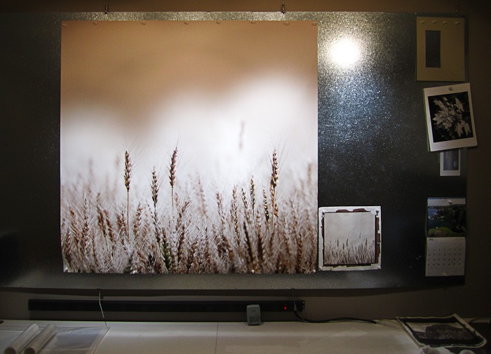
Six months later I’m still loving the configuration. The print viewing board is by far my favourite part of the space. It’s so much fun to hang prints on it and just step back and evaluate. You can see another photo of it on the front page of my printing site, Dane Creek Printing.
The storage is great. The only downside is not having a pretty place to store rolls wider than 17”. Right now they’re all stacked under the window, and it’s a pretty big pile.
The desk space is a bit tight as well. I purposefully went minimal with the desk area, but in hindsight it doesn’t really leave room for my Wacom table. I rarely use it, but when I do I wish I had a bit more space. I could fix this by putting the desk under the window and then standing the rolled paper up where the desk currently sits. Perhaps someday!
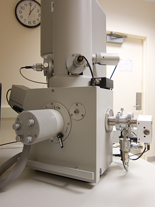
Today was awesome. I got the chance to use a fancy scanning electron microscope (SEM) at the University of Washington Nanotech User Facility thanks to the GEL 2011 Conference, Dee Breger, Alec Pakhomov, and Lindsey Maier .
What did I scan? Prints, of course! I took with me an inkjet print on Ilford Galerie Gold Fibre Silk, a carbon print, a salt print, and a cyanotype. We managed to scan the inkjet, carbon, and salt prints.
I was hoping to be able to see ink particles on paper, and I did! I was also hoping to get a good view of the carbon layers from the carbon print, but in hindsight we used the wrong part of the print as a sample so it was tough to see the carbon specifically, but we did see something else.
At this point you’re likely saying “this post is useless without photos!” and it is. So here’s photos. Lots and lots of photos.
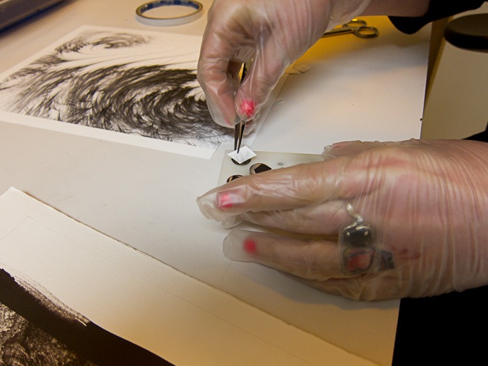
Lindsey, sticking the inkjet sample onto one of the little sample posts prior to coating.
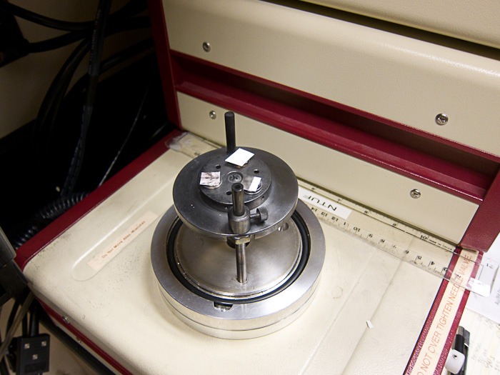
Three samples loaded into the chamber that will coat them with a gold/palladium so they scan properly. From left, clockwise, is the salt print, inkjet print, and carbon print.
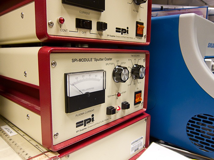
The machine that does the coating. How can you not love a machine called a “sputter coater” that has a “sputter” setting? This machine was a little touchy. Lindsey explained that if you let the milliamps accidentally bounce off 50 you blow a fuse in the back of the machine and then have to scrounge to find a new one. She didn’t blow the fuse. Way to go Lindsey 🙂
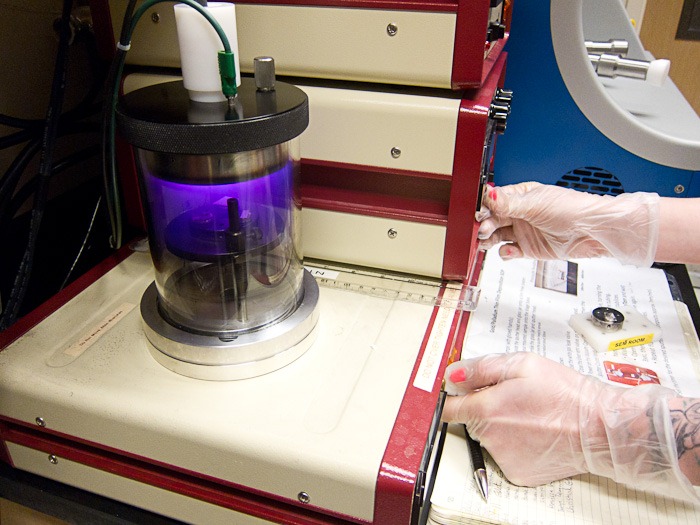
The coating in progress. The purple glow is plasma in the vacuum chamber. She’s twiddling knobs and pressing buttons to kick the coating off.
The scanning electron microscope.
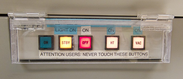
In hindsight I should have taken this photo with my finger in the picture, in the act of “pressing” the buttons 🙂
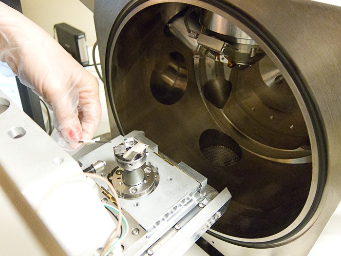
Loading the samples in the SEM. From left, clockwise, is salt (coated), salt (uncoated), carbon (uncoated), inkjet (coated), and carbon (coated). The uncoated ones were to see if there was enough silver or carbon inherent in the prints to scan without the coating, but they didn’t work well.
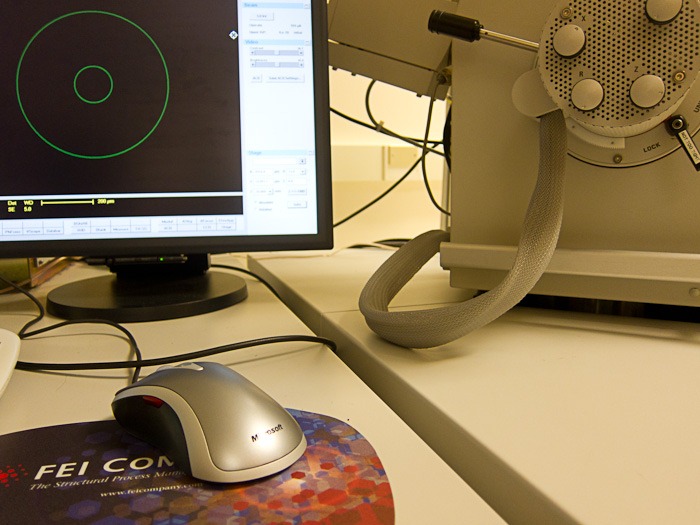
Always nice to see Microsoft represented 🙂 The software on the computer screen is what we used to do all the scanning.
Ok, so you’re probably saying “this thread is useless without pictures FROM THE FREAKING SEM!”. And you’re right. So here’s pictures from the SEM:
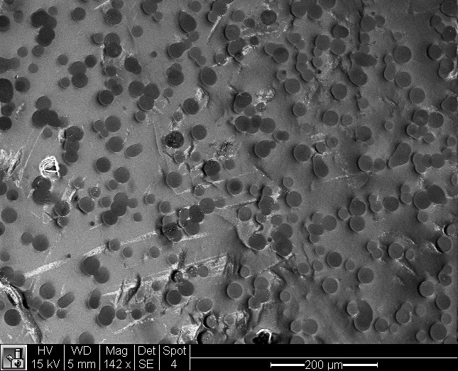
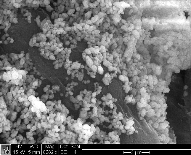
Ilford Galerie Gold Fibre Silk with a black and white image (printed in colour mode) from a Canon iPF5100. On the right is the paper edge where it was cut with scissors. On the left the things that look like ikura are ink blobs. What’s all that bright white stuff in the middle? More on that later…
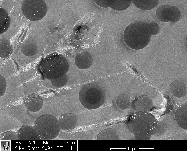
Here’s a better view of the ink on the paper. I’m assuming all the marks under it are light scratches on the surface of the paper.
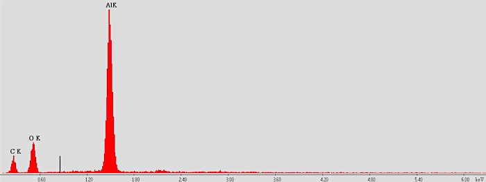
Zooming in closer still to get a really good look at the ink dots. At this point we wondered what the ink was made of, so we switched over to another computer that can do a plot of the elements present. Here’s the plot:
Looks like aluminum! We did a similar scan off one of the ink bubbles and got zero aluminum, so I’d say that’s pretty definitive.
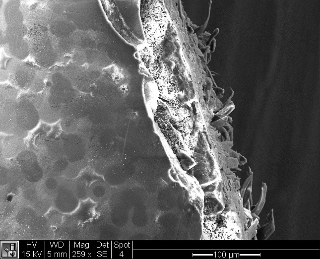
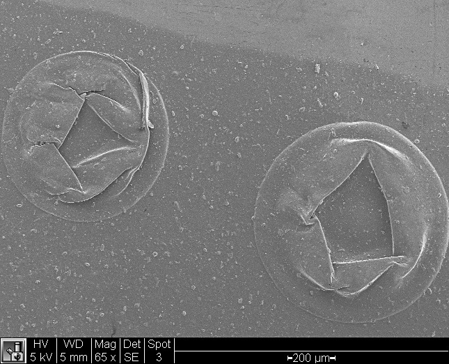
This is a higher magnification view of the weird white stuff on the edge where we cut the paper. Unfortunately I don’t seem to have a screen shot of the element plot we did, but it came up with spikes of barium and oxygen. Baryta, anyone?
The salt print didn’t produce any images that were that interesting, but the above is from the carbon print. It’s the border between where the carbon image is and the base paper (top right). This is the first image we scanned and we couldn’t figure out what on earth these things were. I went back and looked at the original print and it was obvious: they’re bubbles. You can clearly see them all around the edge of the print. I imagine they were formed when the gelatin was being washed away.
The trip to the lab was awesome fun, and a huge thank you to Lindsey for patiently sitting with me to prep the paper and then drive the SEM as we nosed around the samples. Did I mention it was a ton of fun? Because it was!
Thanks to David we had an afternoon of salt printing again. This time Tory came along to give her hand a try at the process and she left with two stunning prints. I only had time for one, which is scanned in above.
I love it!
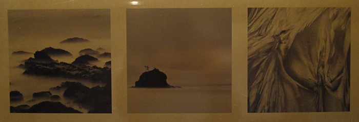
David’s found a new source for paper too, and this stuff has a faint texture (which you can see in the scan) but isn’t as heavily mottled as the previous paper he used. It’s very nice stuff.
Someday I’m going to build a semi-darkroom for this…
At David’s suggestion I called around and found that trophy supply shops can supply pre-cut sheets of aluminum, 12 x 24”, covered in a protective piece of plastic. I figured I’d give it a try and ordered three sheets: satin aluminum, shiny aluminum, and gold-coloured steel.
I finally had a chance to give them a try this weekend. I also decided to use the ICC profile from Booksmart Studio instead of my custom profile to see if that would resolve the issues I had printing in colour last time. Finally, I learned that I can configure any media type on the printer to use the front feed path, so following the instructions at Booksmart Studio I used Semi-Glossy Photo Paper instead of POP Board for these tests.
WOW. What a difference.
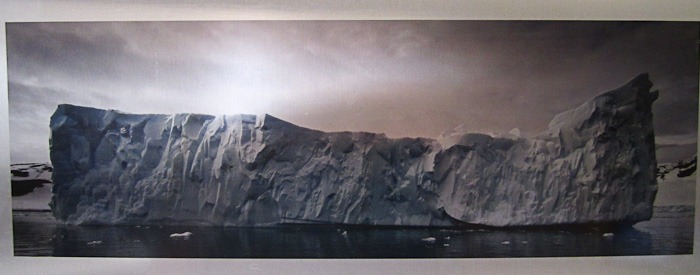
Satin aluminum
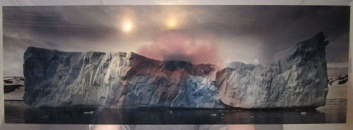
Shiny aluminum (and also a self-portrait!)
Gold-coloured steel
Yay! As you can tell from the two iceberg images the colour problems are solved. The quick photographs don’t do these justice. The icebergs just leap off the page. The shiny aluminum is way too shiny but it was fun to test on. The gold steel is very interesting and works great with my B&W beach images.
At the moment the last remaining issue I have is figuring out how to get clean coatings on the aluminum. You can’t tell in the photo but the satin aluminum coating is awful. There’s dog fur in it and thumbprints everywhere. The shiny aluminum is much better but has streaks (which you can see in the top left of the image). That particular piece was also a test of just doing a single coating of InkAid instead of two.
I’ve tried spraying the InkAid, diluted 10% with distilled water, but it was a complete disaster. Runs everywhere and the stuff came out of my Wagner HPLV sprayer in gobs instead of a nice fine mist. I may try one of David’s really fancy brushes instead of the cheap foam brushes I’m using currently.