Carbon Prints on Moab Paper
After trying my hand at cyanotypes a few weekends ago I spent some time browsing the Bostick and Sullivan website. So many cool things! What caught my eye was the PDF on the front page about carbon prints. I’d never heard of them and honestly they sounded wicked cool.
A quick e-mail to David and a date was set. Today, 1pm, his place. David ordered some of the carbon tissue in advance and already had all the other supplies. He was even kind enough to take care of sensitizing the tissue a few days ahead of time. I brought a box of Moab sample paper I had kicking around. Four hours later I had my first two carbon prints.
Holy doodle.
Before I get to pictures and video I have to tell you that the scans do a horrible job of communicating how incredibly nifty this printing technique is. Unlike every other print I’ve made these actually have depth to them. The darker areas are physically thicker than the lighter areas. That metallic inkjet paper everyone is so excited about? These prints kick their ass.
Ok enough with the talk. Time for some scans. All images are from a digital negative printed on Pictorico OHP using David’s platinum curves from his prior platinum/palladium work, exposed for 4 minutes on paper sensitized with a 3% dichromate solution. Here’s the first attempt using Moab Lasal Photo Gloss 270:
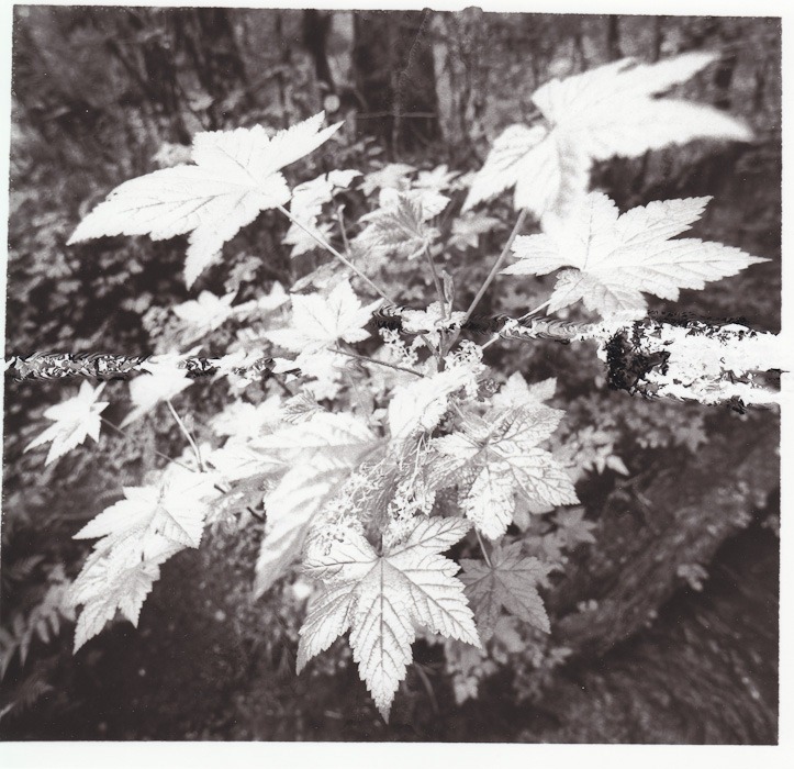
As you can see I screwed up 🙂 When I was using a squeegee to mate the exposed carbon tissue to the Lasal paper I accidentally caused a ripple on the back that transferred through. It does clearly show you what I mean about depth though. Those are real ripples that you can feel with your fingers on the finished print.
The second attempt is on Moab Colorado Satine 245:
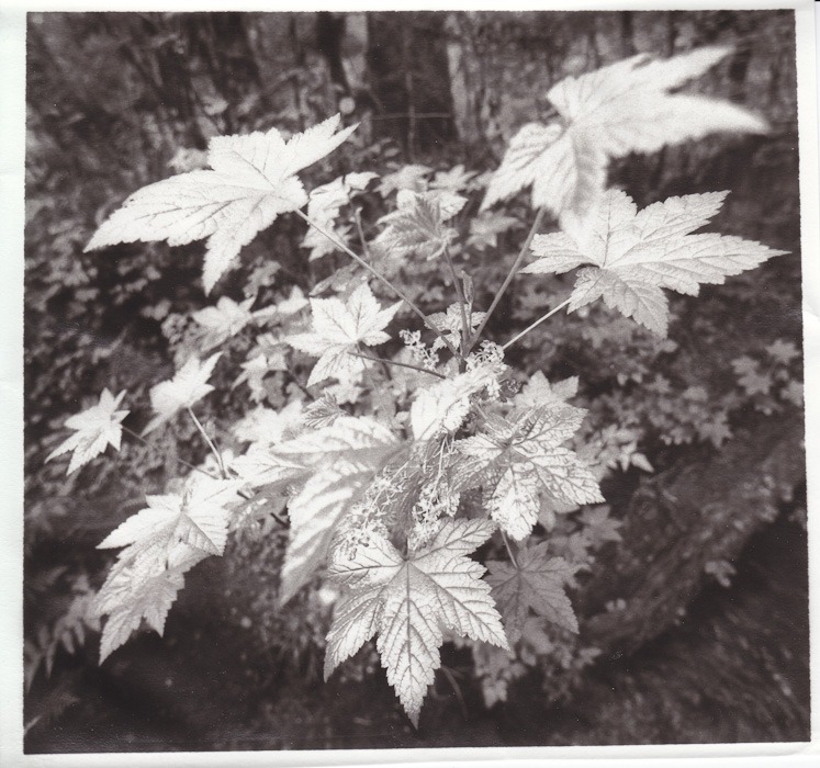
As you can see this one turned out ripple-free. Yeeeeeeeeeeeeha! Considering this was my second every carbon print I’m pretty darn excited. The only downside is the paper did not handle the trip through the water well at all. It curled like crazy while drying and the layers have started to separate. Honestly the finish isn’t nearly as good as the Lasal Photo Gloss.
One of the craziest things about this process is that development actually removes material. In some ways it’s the exact opposite of lith where the shadows come from infectious development. Don’t understand? Check out this little montage of David developing his print (on Moab Lasal Photo Luster 270):
Bottom line: this process is freaking awesome. A few things for me to try next time:
- I want to try another really glossy RC paper, most likely Kirkland Signature Professional Glossy Photo Paper since I have a lot of it around.
- I want to try a matte paper, most likely Moab Somerset Museum Rag. Given what I saw today I have low expectations but I’m willing to give it a shot.
- This process is extremely well suited to images where the foreground objects are very dark when compared to the background. Since the darker areas are physically thicker on the paper they appear to come forward, with the lighter areas receding. In hindsight the image I used for my first test is exactly the other way around!
- The final image needs more contrast. That’s easily fixed in the digital negative though.
- The Lasal paper picked up a wicked dichromate stain (almost fluorescent green/yellow). The Colorado paper fared much better. Both were cleared using metabisulfate and sodium sulfite which helped a ton, although the Lasal paper still has a tint to it.
Thanks again to David for providing all the workroom facilities to make these prints today. We can’t wait to do it again!
Leave a Reply